Creating Effective Websites: The No-Fluff Guide for Developers
Websites are the foundation of being a developer.
But the question is, do you create effective websites?
It’s simple:
Create better websites for your clients and you will get more clients and be able to charge more for your web design services.
Most website visitors scan web pages, so it’s important to portray what the business does and how they can help, all within a few seconds.
The principles we’re going to cover are:
- Keep it simple
- Purpose
- Typography
- Technical
- Colors
- Images and icons
- Navigation
- Call-to-actions
- Videos
If you're a WordPress users, read these helpful speed improvement tips.
Keep It Simple
There’s a common term referred to as KISS (Keep It Simple Stupid).
It’s so easy to complicate things and showcase your knowledge or a new idea that you might have, but we so often forget to literally keep things simple.
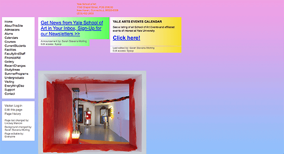
Here’s an example of a terrible website:
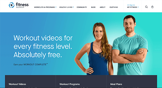
Here’s an example of a good website:
There’s beauty in simplicity and we shouldn’t forget that.
Some of the best performing websites out there are the ones that don’t have all the cool animations and these edgy designs.
This mindset will flow into your overall webpage layout and it will lead to the website visitors performing the desired action.
Layout
As a general rule, you should stick with website conventions.
What are website conventions?
It’s basically the most accepted or understood way of how things are or should be.
Example: It would be weird to have the hamburger menu on mobile in the middle of the page – it should be on the top left or top right and the website visitor expects that.
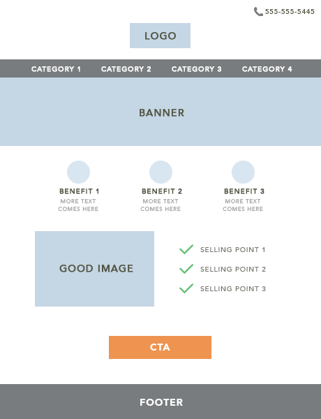
When it comes to the layout, you need to think about 5 things:
- Header
- Benefit to the customer (HOW the business can help them)
- Business services (WHAT the business can help with)
- Call to action (WHY the customer should work with the business)
- Footer
As a rough guideline for 90% of websites out there, this is a good layout to follow:
I recommend the book Don’t Make Me Think which elaborates on this topic.
Purpose
What is the purpose of the website?
Having a pretty website means nothing if it doesn’t achieve the desired outcome for both the business and the website visitor.
It’s YOUR job as the developer to accomplish this, otherwise you’re not doing your job properly – it’s that simple.
This is where you need to have a ‘split-personality.’
PERSONALITY #1:
You need to think like a website visitor landing on a specific page to accomplish a specific task.
PERSONALITY #2:
You need to think like the business owner. What is their goal and what is their purpose for the website? More sales, more leads – what?
Regardless of whether you’re improving existing client websites or creating new client websites, this is how you should think about it.
All of your landing pages need to be aligned with the desired purpose of the client and website visitor in what they’re wanting.
If the purpose is to BUY NOW, you need to make it clear, but you also need to think about persuading the website visitor to buy, otherwise you’re only ticking one of the boxes.
Typography
Typography is your headlines, text and font.
The point of typography is you need to think about communication.
What type of message do you want to portray to the website visitor?
If the business is selling luxury handbags, you should be using very clean and clear fonts like Montserrat or something like that.
If the business is selling cakes, you should be using more fun fonts like Amatic or something like that.
Using the right words in a main and sub-heading can make a massive difference.
Read more about Typography here.
Technical
A website that takes too long to load or doesn’t rank on Google, is not that effective in my eyes.
To check what you can improve on to make your website load faster, click here.
One other technical aspect is to design with SEO in mind.
General SEO nuggets to keep in mind:
- Page Title
- Meta Description
- URL
- Heading Tags
Color
There’s a reason why the big sale signs in supermarkets include red or yellow to persuade you to make a purchase and it’s no different for websites.
The studies of how color influences outcomes in web design are insane.
If you’re selling cakes, your colors should be more pastel and colorful.
If you’re selling luxury products, it should be grey, black and white.
Images + Icons
You need to be intentional when using the right images on a web page.
Using a hero image banner of the business target audience can work well:
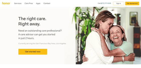
Images should be consistent through the website and should complement the purpose of the site.
I like Deposit Photos for images. It is a premium, but I find it worth it.
For icons, often the simpler outline designs are best for most industries and niches.
Icons should be used to help break up the text and visualize key points such as benefits of the product or service and any workflows.
I like Noun Project for icons and recommend the premium package.
Navigation
As a general rule, there are 2 ways you can create an effective website navigation:
Navigation #1:
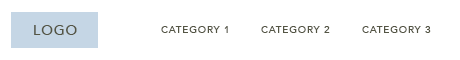
Navigation #2:
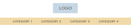
Don’t overlook the categories as well. There may be times it is better to completely remove navigation links and not have any navigation at all – especially on landing pages like below:
The reason you do this is that it reduces distractions.
Another thing to consider is to strategically name the category links.
There’s no reason to have the ABOUT US in the top navigation. The focus should be on the main services/products, call to action and possibly a contact link.
Tip: Remove the ‘HOME’ category link. It’s commonly known to click the logo in the navigation to view the home page. This helps reduce clutter.
Call-to-Actions
A CTA is basically a button with the final purpose of the website, such as BUY NOW or TRY FREE TRIAL or CALL ME BACK, etc.
A very successful case-study of a call-to-action is The Million Dollar Button.
There was essentially only one main change to this website:
The button.
On the checkout page, they changed the word 'REGISTER' to 'CONTINUE' and it resulted in an additional $300,000,000 in additional revenue.
Sounds crazy I know, but this is just an extreme example of how important the right CTA can result in.
That’s why you need to keep testing the position, size, color and different text for each call-to-action until you find the sweet spot.
Videos
Adding videos to websites are crucial.
Every time I suggested adding videos for digital products, physical products and services, the business sales skyrocketed.
The stats are insane:
82% of internet traffic will be video by 2022.
Videos could be animation, interviews, humor, how-to explainers, reviews, features, etc.
Takeaway: Always recommend to every single client that you work with to have a video on their main pages.
---
I hope this article helped you in creating effective websites.
If you’re interested in learning more about this topic and much more, take a look at our new book we’re writing called Web Design & Beyond.