Understanding How Color Affects Outcomes In Web Design
 by Kyle Prinsloo Last updated Oct. 1, 2018
“Color is a power which directly influences the soul.”
This quote by Wassily Kandinsky speaks volumes about our topic, which is how color affects web design.
As web developers, one of our primary tasks is to ensure that every website we create gets across the right message in the right way.
And one of the biggest factors in this is by using (the right) colors.
Choosing a color scheme goes beyond using your client's (or your) favorite colors or even their brand colors.
There are a lot of factors to consider, and in this article, I’m going to discuss most of them.
This article has three main sections:
- The uses of color in designing websites
- Basic colors, their impact on our perception and examples
- Timeless tips in using colors when creating websites
The Uses of Color in Designing Websites
Colors Increase Brand Recognition
Not sure what a “brand” is? Here's a good summary:
 “Brand is the sum total of how someone perceives a particular organization. Branding is about shaping that perception.”
Ashley Friedlein
In the world of business, branding is a big deal, and a huge part of branding is what we call “color branding”.
Color branding is simply using colors to help build an image for a company or influence how people perceive a company.
So let's say a big data processing company wants to be viewed as dependable and trustworthy by their customer or potential customers, they might go for “formal” colors like blue and grey.
If a hotel company wants to be perceived as luxurious, they might go for black, gold or silver.
We’ll talk more about what colors to use to make people feel a certain way, but right now I just want to emphasize the crucial role of color in branding with this statistic:
Color can increase brand recognition by up to 80%
(study by the University of Loyola)
Eighty percent is a big number and this puts more responsibility on how you, as a web designer/developer, execute color branding on your clients’ websites.
Let's try a simple test ☺
I'm ONLY showing you colors. I want you to think of a brand using these colors.
Here it is:

Which brand/business is it?
Got the answer?
...
..
.
If you guessed Google, you'd be joining 91% of people who said the same thing.
It’s your goal to make sure that when people land on your client’s website, they’ll know exactly what company it is and what they do.
Throughout your web development career, you’re going to have two kinds of clients:
Type 1: Those who have already decided on a color scheme
Type 2: Those who still need help with their colors
For the first type of client, your responsibility will be to incorporate their brand color and look for colors that compliment it.
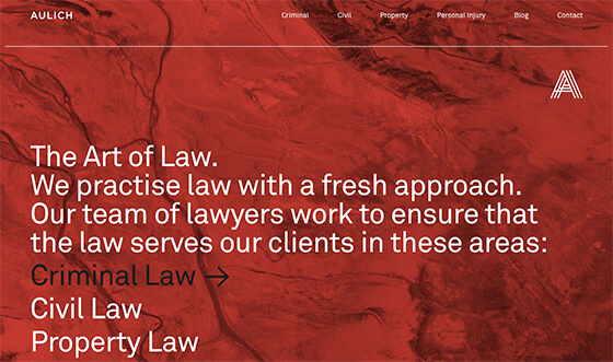
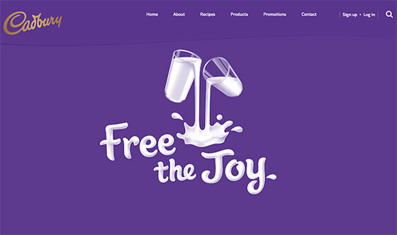
Coca-Cola’s website is an example of color consistency done right.
Red is the brand color and their web development team did a great job in incorporating it on their website through the streaks of red found throughout:
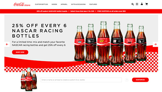
As viewers browse around the site, they’re not going to forget that they’re on the Coca-Cola website because of the red colors.
BlueHost is another example:

Notice how blue is used to divide the page into smaller sections to make it easier to consume information.
Last, but not least, here's a green example by Backlinko:

This website uses green on the sidebar and to highlight important texts.
Moving on:
What if you feel that your client is using the wrong color?
What if you think a funeral company’s choice of red is conveying the wrong message?
This is where you can and should add more value to your client.
Questions like:
- Why did you choose your current brand color?
- How do you feel about it?
- Have you received feedback from customers about how they feel about this color?
- What image would you like to portray for your company?
These are basic questions that will help you understand your client’s branding issues.
Colors Make Certain Elements Stand Out
If you want to draw attention to a button or a specific section, (I hope) you don’t often do it using large arrows or flashing neon lights.
You do it with colors.
Color is often used to highlight elements like buttons, important texts, and subsections.
Call-to-Action Buttons
CTA buttons are buttons that incentivise action like to buy a product, register for a free trial or download an eBook.
Marketers actually go through a lot of data and tests to get the right CTA button copy, color, size, and position.
Why go through so much hassle?
Because having a better CTA button means more business.
Here’s an example of Divi’s CTA button:

A quick look and you’ll see the main CTA here is the green button.
The main button is green not by accident.
They want to lead people’s attention to it and they know that green contrasts nicely with the white, so it will be the first thing that people will notice upon landing on this page.
They do the same thing with another CTA button at the top which says, “Join To Download”.
As a side note: I use Divi and can highly recommend it for web design projects. Click here to read more about it.
This leads me to a big question:
What is the best CTA color to use?
The bottom line is that there is none.
Although green, orange, and red are the most common choices for CTA buttons, there is no single color that guarantees the best conversion rate.
Instead of looking for the “best color”, what you need to aim for instead is creating the highest contrast.
HubSpot ran a test to see which CTA would perform better between a green and red button with no other changes:
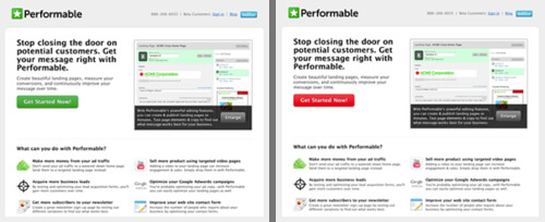
The test went on for a few days and had over 2000 subject visits.
Results: The red button got 21% more clicks than the green.
Does this mean that red converts better than green?
Not necessarily.
You’ll notice that since green is the dominant color of the website, red stood out more. That’s a plausible explanation for its better performance.
It could also be that Performable’s visitors happened to like red.
Another test is by Dmix which showed the red button outperforming the green button by 34%. But again, there could be a lot of factors to explain the result.
A/B testing is the best way to find the “best” CTA button color for a specific website or webpage.
Subsections
Subsections are important parts of a webpage that you want to call attention to.
Going back to Backlinko, take a look at this sidebar:

You can clearly see how the green and orange pop and draw attention.
Colors Influence How People Feel About Your Website
On the subconscious level, color impacts people’s perception more than we think.
This is the main precept of color psychology.
Research by the Institute for Color Research reveals that people make a subconscious assessment of an environment, person, or product within 90 seconds of initial viewing – and between 62% and 90% of that assessment is based on color alone.
Colors have different impacts on our perception and your choice of color can significantly impact users’ first impression on your client’s brand and overall experience on the website.
The way you use color can increase or decrease people’s trust on the website and turn them into loyal customers or not.
When people land on your website, you want them to:
- Trust the website/business
- Be convinced enough to stay on the website
- Persuaded to perform the desired action (CTA)
Everything you do in your design should support these goals.
Colors influence how people feel about a website. Are you creating effective websites?
Basic Colors and Their Impact on Perception
In this section, I’m going to discuss 8 basic colors and their impacts on our perception so you can have a foundation of which colors are suitable for certain messages.
If I say that green is good for finance related websites, you don’t have to use it for every finance related website you’ll make.
I'm just letting you know about the fundamentals.
Red: The Color of Power and Urgency
Red portrays urgency, passion, emergency, survival, courage and aggressiveness, but its shades have slightly different meanings.
Shades of Red
Bright red: energetic, exciting; great for food, beverage, entertainment, adventure companies.
Dark red: authoritative, luxurious; good for companies selling high-priced products and services, educational institutions.
The wrong use of red can make you/the site look: domineering, quick-tempered, resentful, violent, brutal, overbearing, aggressive and angry.
If you want to know more about the impact and use of red, check out this infographic: The Psychology of Red Branding.
Blue: The Hue of Trust
If you want to create a sense of trust, calmness and productivity, blue is the right color. It gives people a feeling of serenity and peace.
Unlike red which makes people feel a sense of urgency, blue lets them bide their time and decide at their own pace if they trust the company and believe what they say.
Shades of Blue
Light blue: creativity; great for tech and creative companies.

Dark blue: intelligence, trust; great for companies that need to build trust like financial institutions, healthcare, government organizations and corporations.
If you’d like to see more websites using blue and how pairing it with other colors works, check this out: Anatomy of Colors in Web Design: Blue and the Cool Look.
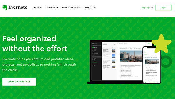
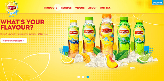
Green: Money, Balance, and Nature
What most people don’t know is green is in the center of the color spectrum, making it the color of balance, equilibrium, and calm.
It is a versatile color that would work great in most industries and its variations matter less than in other colors.
This makes green perfect for the health and wellness industry, eco-friendly or organic products and tech companies.
Here are a few examples of websites effectively using green:
Yellow: Creative, Playful, Unique
It’s no accident that jolly people are often described as “sunny”.
Yellow is the happiest color and makes you feel excited, optimistic, and open to possibilities.
Companies that want to evoke cheerful feelings - like travel agencies or children’s party organizers – would often use yellow to come across as friendly and delightful.
Yellow also works great in differentiating brands as creative, out-of-the-box types.
Orange: Urgency, Durable, Confident
If you want to convey a sense of urgency in a non-intrusive way, orange may be the right fit.
It combines the cheeriness of yellow and the urgency of red, so it’s a great way to come across as durable and confident.

Purple: Sophistication, Success, Imagination
Purple is the color of luxury and sophistication, but its shades have slightly different impacts on perception.
Shades of Purple
Light purple: appeals to women’s sense of class and sophistication; great for companies selling products to women like jewelry and beauty items.
Dark purple: serious, gloomy, mysterious, luxury.
Black: Bold, Classy, Different
Black is a lot more sophisticated than purple, making it a good color for brands that cater to the wealthiest clientele.
Proper use of black lets you create a high level of contrast, helping a website in any industry make a bold statement.

White: Friendly, Sophisticated, Classy
When in doubt, use white.
White is simple and fuss-free but still creative, classy, sophisticated, inviting, and friendly.
White is best paired with strong, loud colors to create a clean, minimalist effect that is still easy to read:
Timeless Tips in Using Colors in Web Design
White Space is NOT Wasted Space
White space is anything that’s left blank on a website.
It doesn't have to be white in color :)
Some people still think that white/negative space is wasted screen real estate; when in fact this space serves a specific purpose.
Have you ever landed on a website and your eyes instantly 'hurt' because of all the colors coming from all directions?
Or maybe you're just so confused about what the business does?
This is exactly what white space helps with.
I like how SquareSpace utizes white space:
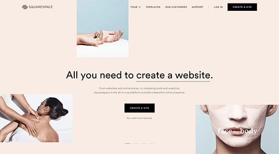
I think there are a few small things they could have made better, but this works well because it's clear and simple.
Let’s not go far for another example. Take a moment to notice the design of my website – the one you’re currently on.
Notice the huge amount of white space?
That’s by design.
I intended to simplify the use of colors and avoid sidebars because white space lets online readers’ eyes breathe and rest.
Mobile and desktop screens already put so much strain on the eyes so your readers will appreciate it if you can help them with what they're looking for.
Benefits of using white space:
- Proper use of white space in margins and in between lines of paragraphs increases comprehension by almost 20% (Human Factors International).
- It allows you to separate texts, images and sections so that you can present individual ideas/concepts in a more organized way.
- White space creates balance. Too much white space gives the impression that your website lacks content, but a lack of it leads to disorganization and confusion.
- It lets you highlight CTAs by creating high levels of contrasts.
Provide Contrast to Keep Your Website Enticing
Look at this website for a moment:
It's unappealing and boring at first glance because it places grey-toned texts and pale-colored images against a pale gray background, making everything seem bland and uninteresting.
If users have to squint to read your text, you have to change the font or the background color.
Here’s another one:

The line at the top - “Request a personal consultation” - is hardly visible and the paragraph below is also tough to read.
The key to making everything stand out nicely is to use colors that contrast.
Use the Color Wheel in Selecting Your Color Scheme
The color wheel is a visual representation of the relationships of colors.
Adobe Color CC is a helpful color wheel tool that you can easily use to find color schemes.
Complementary colors contrast each other and are great to use if you want to highlight elements on your website:
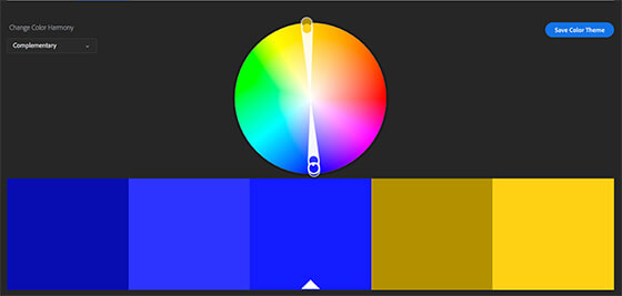
So if your website’s dominant color is blue, a good contrasting color to use would be yellow to highlight important elements like CTAs and subsections.
--
Here's a recap of what we discussed:
- Color increases brand recognition, highlights important website elements and influences how people feel about a website.
- Different colors produce different emotions in people, so it's important to choose the right colors.
- White space, contrast and good color schemes are vital elements of good web design.
I hope that by now, you feel more confident in choosing colors for your next web design projects.
If you're interested in delving into this a lot more, check out my new eBook here.
Let me know if you have any questions ☺