Web Design Tips for Beginners: The Ultimate Guide
 by Kyle Prinsloo Last updated June 15, 2022
This is the longest article I’ve ever written.
It’s massive, but valuable.
By the end of this guide, you’ll know how how to create effective websites for clients.
Here’s what I cover:
- How You View a Website
- Colors
- Buttons
- Shadows
- Images
- Popups
- Footer
- Landing Pages
- Layout + Purpose
- Typography
- Technical
- Navigation
- Videos
- Call to Actions
- Top Navigation Strip
- The Web Design Process
- eCommerce
- Blog Pages
- Tracking + Reporting
- Conclusion
Grab a coffee ☕ (not a tea) and let’s get into it!
Quick thanks to Editor X for sponsoring this article.
It's my favorite no-code/low-code website builder. Try it for free and let me know what you think 🙂
If you prefer the TLDR version, here's the video:
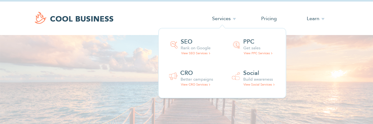
How You View a Website
Before getting into the real ‘meat’ of this article, we need to lay the foundation and that all starts with how you view a website.
Why is this important?
If you just view it as just a ‘website’, every decision you make from there will be based on how you view it.
Here’s a scenario:
Bob views a website as ‘just something every business should have because it’s important.’
Nige views a website as a crucial aspect of growing a business and knows that the importance of having the right website with the right messaging, calls-to-actions and marketing channels can ultimately determine if a business will be successful or not.
I want you to notice the differences here:
Bob understands that it’s important to have a website, but he can’t define the reasons behind it properly.
Nige understands that without the right website, a business can fail, and with the right website, a business can grow significantly with increased sales.
Why is this important?
How you communicate with prospective clients and how much you charge for your services is a direct influence from this.
To illustrate what I mean, I’m going to ask you a question:
How much does a business logo cost to design?
- $5?
- $50?
- $500?
- $5,000?
What would your answer be?
…and why would you answer that?
Depending on who you ask this question to, the answer will differ.
Alice, who understands the value of what a brand represents, how it resonates with clients and the perception it portrays, charges $999 for a professional logo design.
Bob, who understands the importance of every business having a logo, charges $199 for a professional logo design, because he knows it’s a competitive price to charge.
What’s the difference between these 2 people?
- Alice charges based on VALUE
- Bob charges based on COMPETITION
One might say, “yes, but Alice will obviously have more knowledge and expertise compared with Bob, that’s why she can charge more”.
This way of looking at it is wrong, and here’s why:
Alice EDUCATES her prospective clients before they sign up.
How?
They read her blog articles, watch her videos on YouTube, look at her Instagram posts and read her free eBook called ‘What A Logo Represents’.
Bob is charging the amount he’s charging, because it’s the ‘going-rate’ and everyone else does it.
The bottom line is, I don’t want you to be the ‘Bob of logo design’.
Yes, I’m talking about logos here, but the principle is no different with a website…
I know people who are very skilled in web development, but they just charge ‘the going rate’ compared to others who only know WordPress development, but they charge double-to-triple what the ‘going-rate’ is, and they actually get clients.
You’ll ALWAYS get those people who view websites like Bob and they will keep charging Bob’s fees.
I don’t want you to be like that. I want you to understand the importance of what you are helping a business with.
Takeaway:
Think more like Alice.
You might be asking why I’m stressing the fact of pricing in this article, but it’s important because it determines the type of clients you deal with and how to manage their expectations.
The most demanding and fussiest clients are those who pay the least.
They don’t treat you like a professional and don’t value your suggestions/input.
You can ultimately create a fantastic website, but they will just be fussy either way.
So pricing goes hand-in-hand with creating effective websites because it will affect the perception and outcome of the project and your deliverable services.
Here’s the most under-rated and forgotten way of thinking about it:
It’s your responsibility to influence how your prospective clients think about a website.
You will ALWAYS get prospective clients who want the cheapest deal out there, but you don’t want to work with these clients.
You need to see a website in the right light, but so does your prospective client.
After all, you can’t sell something based on value, if they don’t SEE the value in what it can do for their business.
So the question is, how do you attract the right clients who see the VALUE side of a website?
YOU are the one who dictates their perception of what they think of you and also the potential of what a website can do for their business.
How do you communicate the value?
Everything from the following:
- Your Website
- Messaging/Content
- Pricing
- Blog Articles
- Social Posts
- YouTube Videos
- Podcasts
- Writing for Other Websites/Magazines
- Your Questions and Your Answers
One great ‘trick’ is to have case studies on your blog where you discuss what works and what doesn’t work for your respective web design niche.
So for example, let’s say your niche is Plumbers, you can do research on these article ideas to write:
- 5 Top Plumbers Dominating the Internet in the US Today
- What You Can Learn from These 3 Plumber Websites
- Don’t Make These Plumber Internet Marketing Mistakes
In my mind, one of the main reasons why creating effective websites are important is because it can result in more income.
How does it do this?
If you deliver a quality, effective website for a client, they will keep you on board for updates, different business websites and also tell their friends about you.
So I can’t stress this point enough as we build the foundation of WHY effective websites are important, because everything else flows from this.
Before getting into the real ‘meat’ of the book, we need to lay the foundation.
It’s always good to push the boundaries in creating awesome looking websites, but we also have to acknowledge the website visitor’s expectations and that’s basically what web conventions are - “the normal way of doing things.”
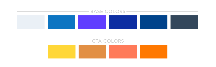
Colors
As web developers, one of our primary tasks is to ensure that every website we create gets across the right message in the right way.
And one of the biggest factors in this is by using (the right) colors.
Choosing a color scheme goes beyond using your client's (or your) favorite colors or even their brand colors.
There are a lot of factors to consider, and in this section, I’m going to discuss most of them.
This section is broken into 3 parts:
- The Uses of Color in Designing Websites
- Basic Colors and Their Impact on our Perception
- Tips in Using Colors When Creating Websites
The Uses of Color in Designing Websites
Colors increase brand recognition.
Not sure what a “brand” is?
A brand is literally what people perceive you to be.
Once brands are tarnished, it’s very difficult to build trust again – especially in the social climate we live in today.
In the world of business, branding is a big deal, and a huge part of branding is what we call “color branding.”
Color branding is simply using colors to help build an image for a company or influence how people perceive a company.
So let's say a big data processing company wants to be viewed as dependable and trustworthy by their customer or potential customers, they might go for “formal” colors like blue and grey.
If a hotel company wants to be perceived as luxurious, they might go for black, gold or silver.
We’ll talk more about what colors to use to make people feel a certain way, but right now I just want to emphasize the crucial role of color in branding with this statistic:
Color can increase brand recognition by up to 80%
80% is a big number and this puts more responsibility on how you, as a web designer/developer, execute color branding on your clients’ websites.
Let's try a quick test 🙂
I want you to think of a brand using these colors.
Here it is:

Which brand/business is it?
Got the answer?
...
If you guessed Google, you'd be joining 91% of people who said the same thing.
It’s your goal to make sure that when website visitors land on your client’s website, they know exactly what company it is, what they represent and what they do.
Throughout your freelancing career, you’re going to have two kinds of clients:
Type 1: Those who have already decided on a color scheme
Type 2: Those who still need help with their colors
For the first type of client, your responsibility will be to incorporate their brand color and look for colors that compliment it.
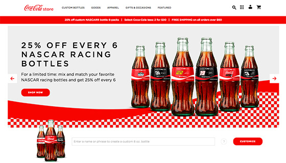
Coke's website is an example of color consistency done right.
Red is the brand color and their team did a great job incorporating it on their website through the streaks of red:
BlueHost is another example:
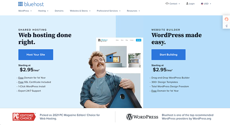
Notice how blue is used to in the header, hero (main) image, icons and headings to for a professional and trustworthy perception.
I love this example by Backlinko:
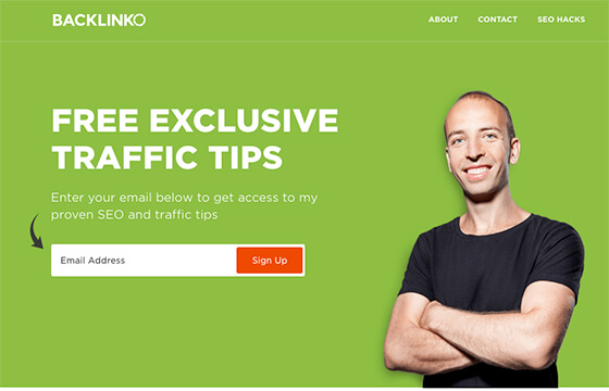
This website uses a solid green color, which makes the white pop and draws your eyes to the orange Sign Up button.
Moving on:
What if you feel that your client is using the wrong color?
What if you think a funeral company’s choice of red is conveying the wrong message?
This is where you can and should add more value to your client.
Simple questions like:
- Why did you choose your current brand color?
- How do you feel about it?
- Have you received feedback from customers about how they feel about this color?
- What image would you like to portray for your company?
…will help you understand your client’s branding issues and it will help you in creating their website and brand identity.
Colors Make Certain Elements Stand Out
If you want to draw attention to a button or a specific section, (I hope) you don’t often do it using large arrows or flashing neon lights.
You do it with colors.
Color is often used to highlight elements like buttons, important texts, and subsections.
Colors Influence How People Feel About Your Website
On the subconscious level, color impacts people’s perception more than we think.
This is the main precept of color psychology.
Research by the Institute for Color Research reveals that people make a subconscious assessment of an environment, person or product within 90 seconds of initial viewing – and between 62% and 90% of that assessment is based on color alone.
Colors have different impacts on our perception and your choice of color can significantly impact users’ first impression on your client’s brand and overall experience of the website.
The way you use color can increase or decrease people’s trust of the website and turn them into loyal customers or not.
When people land on your website, you want them to:
- Trust the website/business
- Be convinced enough to stay on the website
- Persuaded to perform the desired action (CTA)
Everything you do in your design should support these goals.
Basic Colors and Their Impact on Our Perception
Colors and their impacts on our perception influence our decisions, so it’s crucial to understand the fundamentals of this section.
42% of shoppers form an opinion of a website based on its design, including color scheme and 52% of shoppers do not visit a website again if they don’t like its aesthetics.
According to research, up to 85% of shoppers indicate that color is the primary reason why they buy a certain product. Think about going grocery shopping and all the yellow and red that stands out at you – this is not by coincidence.
They (Neuroscientists and Psychologists) know that if they were to use brown as the main color for promoting deals, it would result in terrible results compared with red and yellow which influences quick purchasing decisions.
And this is no different in websites.
Note #1: If I say, or the statistics say, that green is good for finance related websites for example, you don’t have to use it for every finance related website you create.
Note #2: Colors can mean different things for different cultures. For example, in Western cultures, black can represent death, but in Hindu and Chinese cultures, white often represents death. Obviously it depends where and how you use it.
There are cases where going against the norm can work, but it just needs to be thought out well.
Here are the fundamentals:
Red: The Color of Power and Urgency
Red portrays urgency, passion, emergency, survival, courage and aggressiveness, but its shades have slightly different meanings.
Bright red: energetic, exciting; great for food, beverage, entertainment, adventure companies.
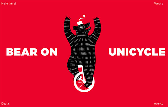
This is an example of a digital marketing agency. It’s bold, powerful and grabs your attention.
Dark red: authoritative, luxurious; good for companies selling high-priced products and services, educational institutions.
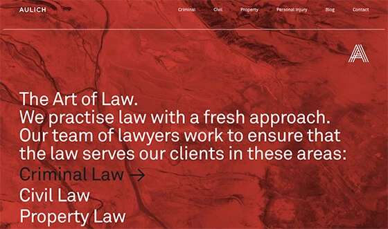
This example above is a great illustration of this. Criminal Law is big business, and they’ve rightfully blended the authoritative, powerful and classy look they were looking for.
The wrong use of red has some drastic ‘side-effects’ with the wrong perception like: domineering, quick-tempered, resentful, violent, brutal, overbearing, aggressive and angry.
Blue: The Hue of Trust
If you want to create a sense of trust, safety, calmness and productivity, blue is the right color. It gives people a feeling of serenity and peace.
Unlike red which makes people feel a sense of urgency, blue lets them bide their time and decide at their own pace if they trust the company and believe what they say.
If in doubt, blue is always a ‘safest’ color to choose, however, it can also give the perception of no emotion or coldness if not used correctly.
In fact, if you take a look at the Fortune 500 companies in the world, you’ll notice that almost half of their logos are blue. Pretty interesting, right?
You will often find blue in businesses/organizations/sectors like:
- Banks
- Finance and Insurance companies
- Tech companies
- Medical/Healthcare Institutions
Light blue: creativity and tranquility; great for tech and travel companies.
Dark blue: intelligence, trust; great for companies that need to build trust like financial institutions, healthcare, government organizations and corporations.
Green: Money, Balance, Health and Nature
Green is in the center of the color spectrum, making it the color of balance, natural, healthy, growing, nature, and calm.
It is a versatile color that works great in most industries and its shade variations matter less than in other colors.
You will often find green in businesses/organizations/sectors like:
- Health and Wellness
- Tech Companies
- Nutrition/Organic
- Money
Here are 2 examples of websites effectively using green:
Yellow: Creative, Unique, Playful, Digital
Yellow is the ‘happiest’ color and makes you feel excited, optimistic, and open to possibilities.
Companies that want to evoke cheerful feelings would often use yellow to come across as friendly and delightful.
Yellow also works great in differentiating brands as creative, out-of-the-box types.
Orange: Urgency, Durable, Confident
If you want to convey a sense of urgency in a non-intrusive way, orange may be the right fit.
It combines the cheeriness of yellow and the urgency of red, so it’s a great way to come across as durable and confident.
Orange is a great color to draw attention.
You will often find orange in businesses/organizations/sectors like:
- Activity/Outdoors
- Sports
- Food
- Marketing
- Logistics
Pink: Calmness, Love, Femininity, Vibrancy, Youthfulness
Pink can influence emotions and has a lot of different meanings. It often represents calmness, love, youthfulness and femininity.
You will often find pink in businesses/organizations/sectors like:
- Makeup and Beauty
- Female Products
- Wedding Planning
- Baking
- Child-related
- Innovative Companies
Light pink: generally appeals to women’s sense of class and sophistication; great for companies selling products to women like clothing, jewelry and beauty items.
These examples are great illustrations of a soft, pastel-like pink which is easy on the eye.
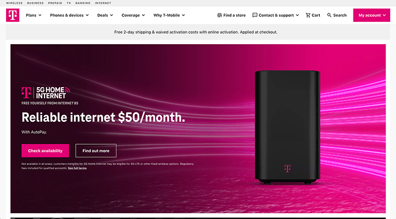
Bright pink: T-Mobile is a company known for going ‘against-the-grain’ and it shows their boldness and confidence through this bright pink.
Black: Bold, Classy, Luxury
Black is considered as a "luxury" color appealing to the luxury market, which explains why so many of the leading luxury brands use it.
Proper use of black lets you create a high level of contrast, helping a website in any industry to make a bold statement.
If you or your client is selling high-end products or services like:
- Luxury Goods
- Cosmetics
- Fashion
- Butler Service
Added tip for using black:
A hint of gold, grey and white can really make it pop and look super classy to portray that ultra-edge of elegance.
I don’t want to go on and on about black, but it’s a color I’m fascinated about.
Think of other luxury brands that make use of black as well:
- Prada
- Zara
- Yves Saint Laurent
- Chanel
- Hermes
- Cartier
- Patek Philippe
- Burberry
The reason why I like it so much is because it illustrates the exclusivity and portrays class in a brand to justify the insane prices.
As a side note: I highly recommend the book Oversubscribed by Daniel Priestly. He talks about this psychology in a lot of detail.
White: Friendly, Sophisticated, Classy
When in doubt, use white.
White is simple and fuss-free but still classy, sophisticated, inviting, and friendly.
White is best paired with strong, bold colors to create a clean, minimalist effect that is still easy to read.
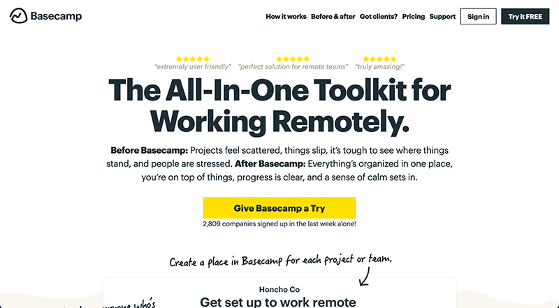
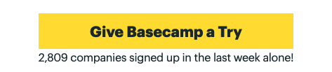
I like Basecamp's simplicity with the call to action clearly visible in contrast to everything else:
And Apple uses white, black and gray in a way that makes it look clean and classy:
Tips for Using Colors in Web Design
White Space is a MUST.
It can seem like a simple section to read through, but I really want you to slow down for this section on white space.
A lack of white space (or negative space) is one of the biggest design issues I see web developers make.
What do I mean by white space?
It’s the area on a website page that is blank with no text or images.
2 Takeaways:
- White space doesn’t have to be ‘white’ in color.
- White space serves a specific purpose.
Have you ever landed on a website and your eyes instantly 'hurt' because of all the colors, or maybe you were just so confused about what the business actually does?
This is exactly what white space helps with.
Some other benefits:
- Proper use of white space in margins and in between lines of paragraphs increases comprehension by almost 20%.
- It allows you to separate texts, images and sections so that you can present individual ideas/concepts in a more organized way.
- White space creates balance. Too much white space gives the impression that your website lacks content, but a lack of it leads to disorganization and confusion.
- It lets you highlight CTAs by creating high levels of contrast.
- Mobile – mobile traffic is increasing significantly and if you want to get the right message across, it needs to be simple with no distractions.
Just look at this simple example of how space can make a massive difference:
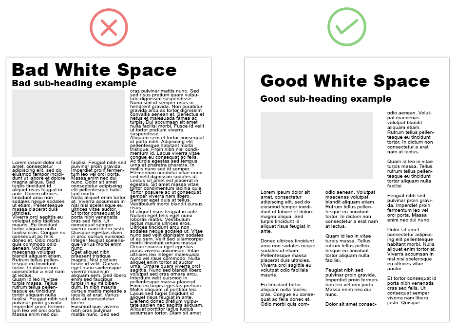
Take note of the page margin, heading space, line height in paragraphs and image padding.
The only thing different between these 2 examples is the use of white space.
You might think that this is just a newspaper example, but this principle applies in web design as well.
Take a look at the following wireframe web design options:
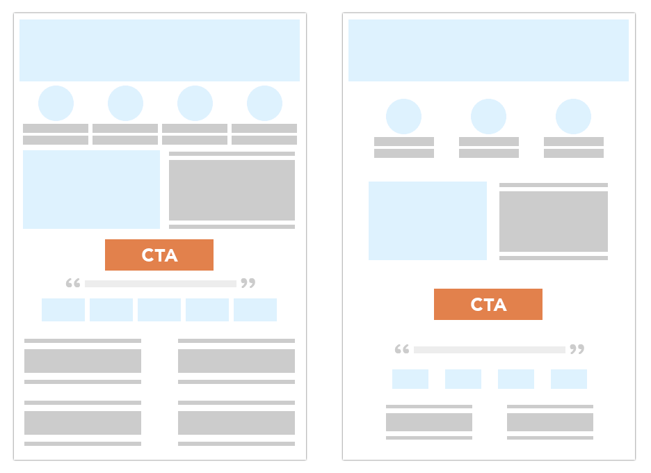
I’d be surprised if you don’t prefer the option on the right.
Takeaway: use white space effectively for every page element (images, text, CTA, etc.).
Double Takeaway: make sure the white space is the same size. You can’t have a top padding of 30px and a bottom padding of 20px. It just looks weird. Keep it consistent.
Some examples of websites that use white space well:
When it comes to web design, keeping it simple and focused with the right amount of white space is key. Please don’t forget this.
Provide Contrast to Keep Your Website Enticing
A layout where everything is the same color, size and shape often looks boring and it doesn’t capture one’s interest, but having contrast keeps the website visitor more focused and attentive.
The general rule for using effective contrast is this:
If website visitors have to squint to read your text, you have to change the font family, font size, font color or the background color.
To illustrate this practically, here are 2 poorly designed contrasting examples:
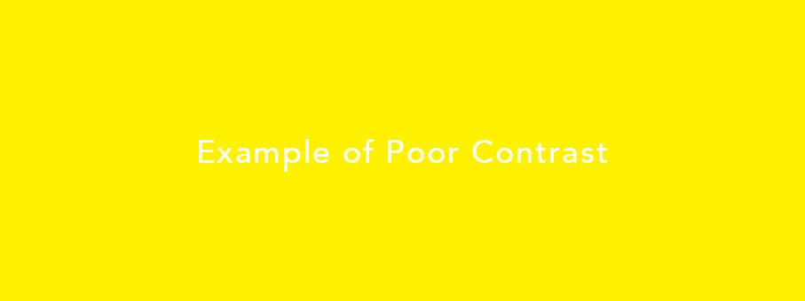
This one above used be the main page on Squarespace a few years ago. The only positive on this page is the layout – everything else from the colors, font size and CTA is really not good and I’m glad they changed it.
So, how do you know what’s a good contrasting color?
Learn more in the next step.
Use the Color Wheel in Selecting Your Color Scheme
The color wheel is a visual representation of the relationships of colors.
Adobe Color is a helpful color wheel tool for easily generating color schemes.
I like using the Analogous and Complementary options on the left side.
Literally just drag the pointer to the color you’re interested in, and it will provide supporting colors.
If you need some color inspiration and don’t know where to start, I like Coolors.co and Design-Seeds.com (filter by color search).
Complementary colors contrast each other and are great highlighting elements like a CTA.
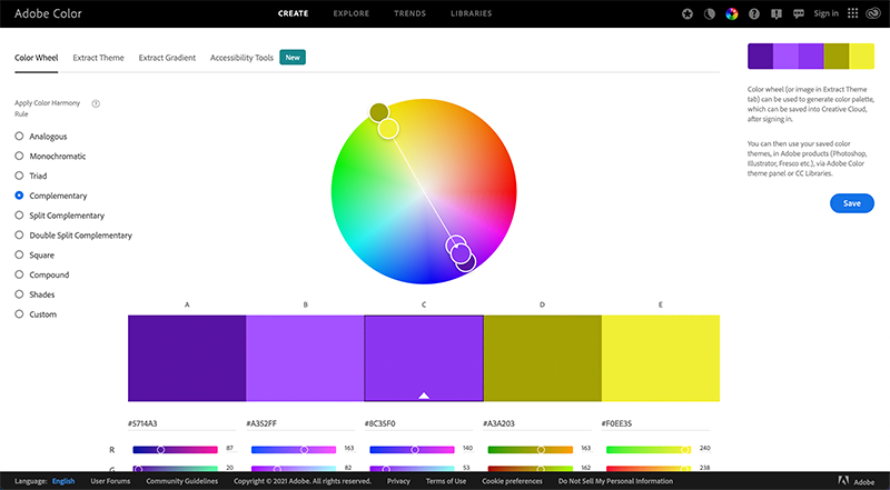
So if your website’s dominant color is blue, a good contrasting color to use would be yellow or orange to highlight important elements like CTA’s and subsections.
It’s quite interesting to observe that most software/tech companies like Ahrefs, HubSpot, SEMrush, Instapage, Lead Pages and Unbounce have a similar color scheme.
They use blue, orange and/or yellow shades like these:
And based on the color psychology we went through earlier, it makes sense.
If you look at what’s known as the color wheel, it’s a great color scheme to have.
Here's a recap of what we discussed in the color section:
- Color increases brand recognition, highlights important website elements and influences how people feel about a website.
- Different colors produce different emotions in people, so it's important to choose the right colors.
- White space, contrast and good color schemes are vital elements of good web design.
As a final takeaway on colors, I want to leave you with this simple design that I hope illustrates the role that color plays in our perception:
...just doesn't work, right?
I hope that by now, you feel more confident in choosing colors for your next web design projects.
Buttons
Buttons are not just little rectangular blobs on a screen.
They play a crucial part in interacting with a website and getting the desired results.
As a starter, it’s important to remember that a button should not create more doubts like if it’s actually a button or what the next step should be.
A button needs to LOOK clickable, be CLEARLY visible and GUIDE the next step.
So there are 3 main takeaways:
- A button needs to look clickable.
- A button needs to be clearly visible.
- A button needs to guide the next step.
Button Shape, Size, Color, Shadow
There are 4 ways to design effective buttons:
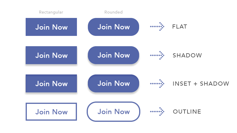
Shape
Generally speaking, there are 2 button shapes to choose between:
- Rectangular (squared)
- Rounded
Which shape do you choose? I wouldn’t lose sleep over that. You should do tests to see which shape performs better in terms of getting the most clicks.
What’s important here is consistency. You can’t have rectangular and rounded buttons, it needs to be either option and stick with it.
Size
As a general rule for sizing, the left and right padding should be 2X the top and bottom padding.
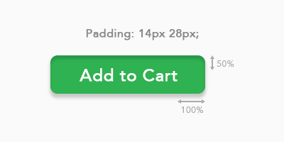
Another thing to keep in mind with button sizing is to consider mobile.
It needs to be clearly visible. If in doubt, make it bigger on mobile.
We discussed color a lot already, but what I will mention is that a contrasting color is good to use for your button.
So let’s say the main color of the website is blue, you could use yellow or if it’s green, you could use orange.
That said, primary buttons (more on this below) are generally a filled color, compared with a secondary button which is generally an outlined color.
Most importantly, you need to keep running tests to see which color performs better.
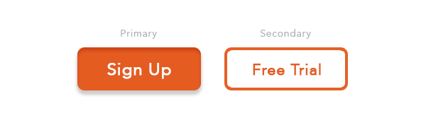
Primary and Secondary Buttons
There are different types of buttons and it’s important to know when to use which type and why.
Primary
A primary button is the main button. It’s the desired call-to-action you’d like the website visitor to take.
Secondary
A secondary button is the second most important button. So if the primary is the main call-to-action is focused on making a purchase, the secondary button is more a ‘low-risk’ action like a Free Trial or Free Sample or Demo or something that doesn’t require too much monetary investment at first.
Most people neglect to use a Secondary button and it can really be effective.
Here’s a visual example for perspective:
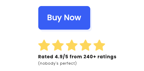
I like how Amazon uses Primary and Secondary buttons. It’s genius. Take a look at the below (right side) and think about why they did this:
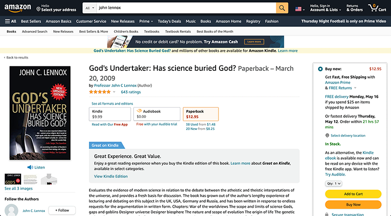
Both buttons are call-to-actions and both have buyer-intent for a purchase, but the subtle difference between the two is really good.
When used individually, we all know that either button is to make a purchase.
But when they are used together, the ‘Buy Now’ is hyper-focused to order the product and that would be considered the Primary button.
The ‘Add to Cart’ is almost seen as less of a commitment as you can always come back later to buy, but it’s in your cart and you’re more likely to just checkout compared to if it wasn’t there at all.
Below is an example from 1Password that uses Primary and Secondary buttons well:
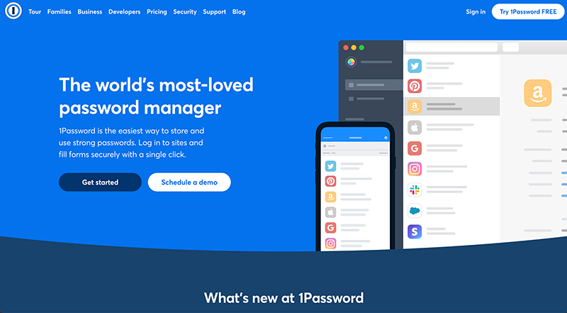
The only thing I don’t like about it is the color of the ‘Get started’ button. I would prefer a contrasting color like yellow to make it pop more.
NordVPN has a clear and concise Primary button and call to action:
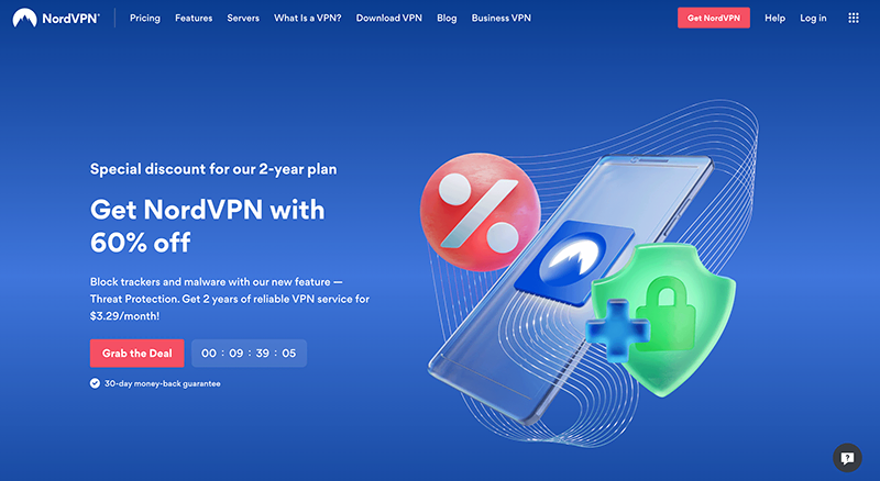
See how the color makes a big difference?
I don’t know if you see it, but there are a lot of strategic things going on here.
The one I want to point out is the text underneath the button which brings me to the next point.
Text Underneath Buttons
Adding a short, simple sentence underneath a button can significantly increase the chances it will get clicked.
To prove the point, which one would you click?
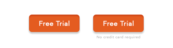
The right option wins hands-down.
Can you see what such a small difference can make?
Adding text like:
- Easy returns
- Money back guarantee
- Cancel anytime
- No credit card required
…can result in a higher click-through-rate, so please remember this.
Shadows
Adding shadows to elements can help make it stand out and it often just refines the look of everything.
Here are a few examples to consider:
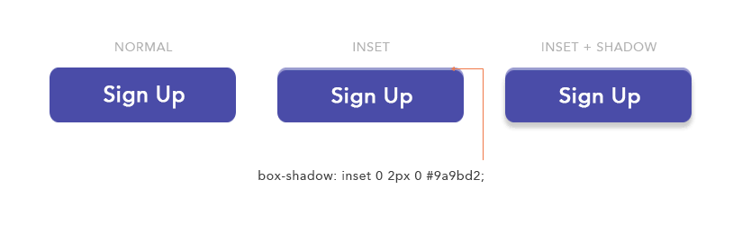
Shadows for Buttons
Using a shadow (a darker shade of the button) and inset (a lighter shade of the button) for buttons make it look way better – like it’s more clickable. It’s an easy tip, so make sure you do this.
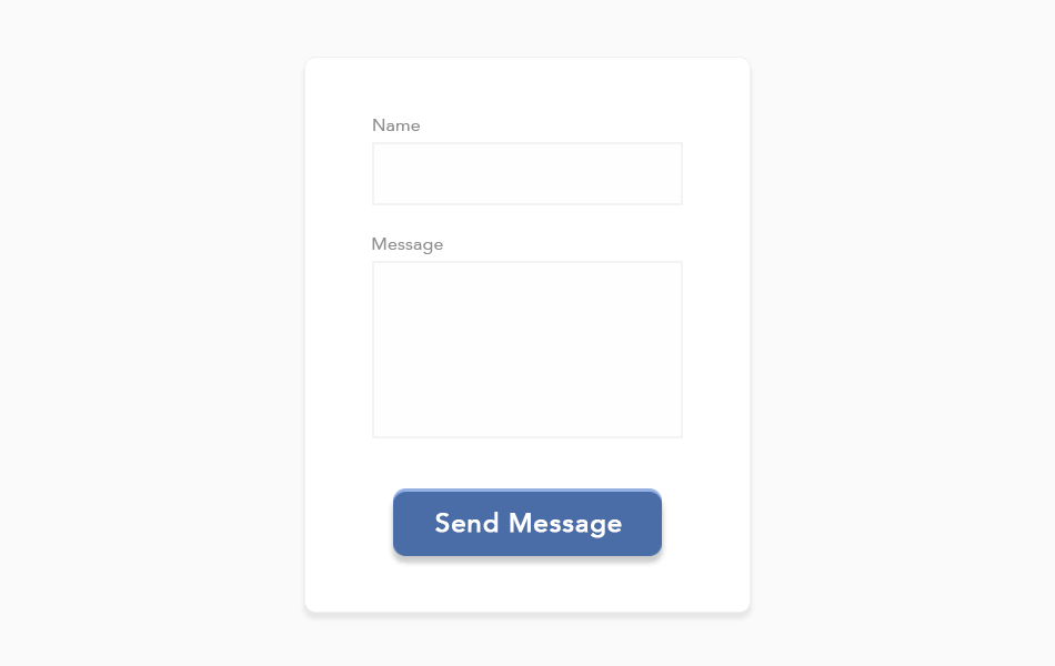
Shadows for Elements
Adding a shadow to elements like the 3 ‘cards’ create a nice subtle and professional look without it being too distracting:
And this ‘card shadow’ is great for forms as well:
Images
Starting off, you need to be working with quality images.
What do you do if a client provides you with low-quality images?
You politely say you that poor quality images will affect his/her business and the only way you can help them is if they provide quality images.
They (or you) need to invest in a photographer – it’s that simple. Quality images = quality outcome and you’re not in the business of producing otherwise.
You can also use quality stock images (from DepositPhotos) depending on what business they’re in.
Another important thing to remember with images is you don’t want to just use an image because it looks pretty. It needs to serve a purpose and images are a part of the communication to the website visitor, so what type of message do you want to portray?
Most of the time, it’s good to have a team photo to help establish that human connection. People want to deal with people, and this helps build more trust.
Image Sizes
There is a fine line between getting the right quality and getting the page to load fast.
You can’t have a page that has amazing quality pictures and it takes 10 seconds to load – the website visitor is not going to wait that long.
So how do you get around this?
You can compress (reduce the file size) of the images in the following ways:
- Use a CDN – this is a network of servers around the world and the main focus of it is to improve performance and load speed of your client’s website.
- Publitio – this is a third-party hosting platform for images to speed up load time.
- TinyPNG – this compresses image file size.
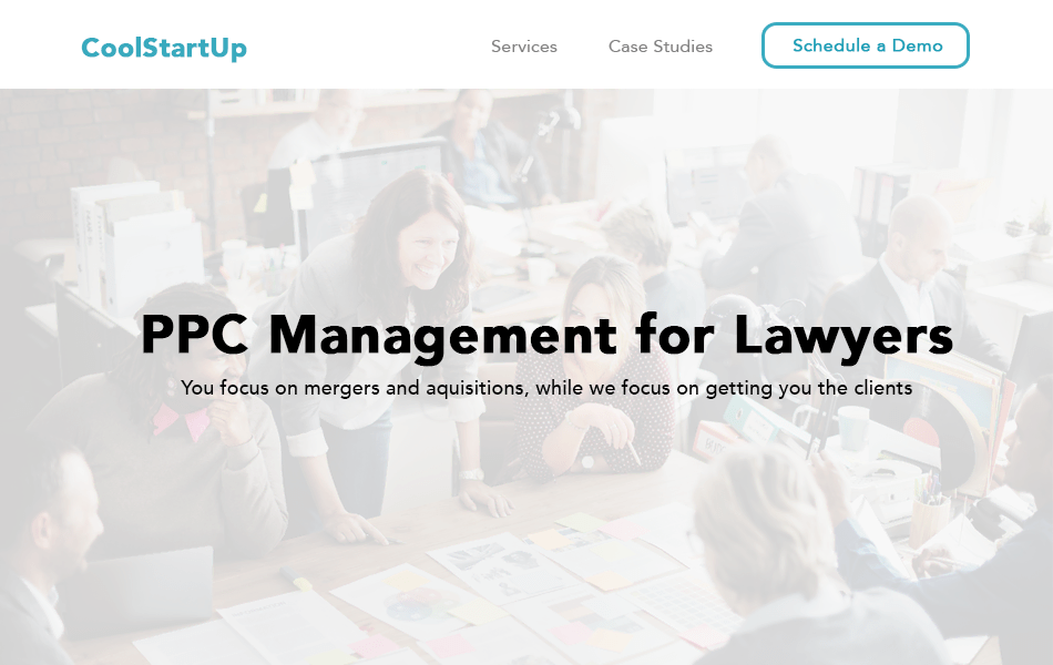
Text on Images
Nothing is worse than seeing text over background images and you can’t even read what it says.
The above example sucks. But still, so many developers make this rookie mistake.
Here are a few design examples to make the text more visible:
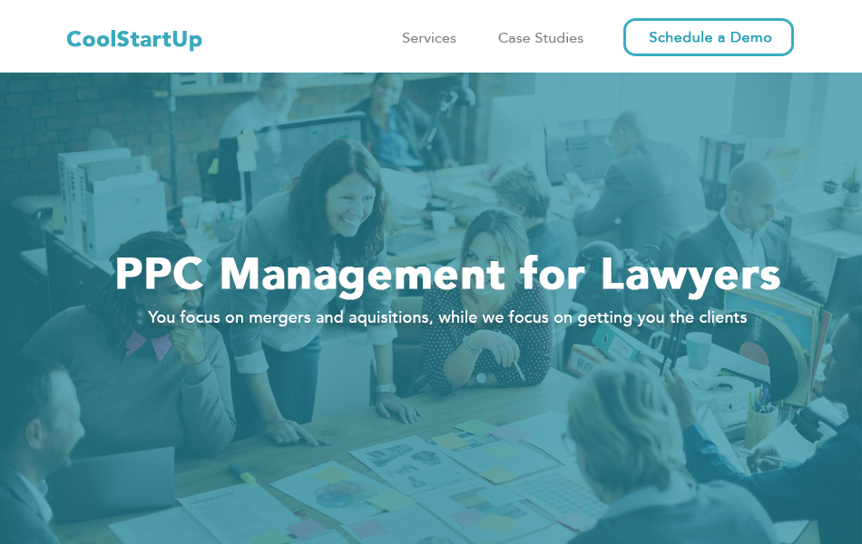
The above opacity color is based on the business/logo color theme and it always looks cool. You can also use a darker color like black, but I personally prefer to use the existing color scheme.
Another option is to go the lighter look, but with inverted headline colors:
You can either use good old CSS for this opacity layer, or you can add a layer over the image with your designs in Photoshop or whatever program you use to edit images.
Illustrations
What are illustrations?
It’s just a creative graphic image that is relevant to the content around it.
I think these illustrations are cool:
It’s simple: using professional illustrations looks cool, it portrays the right message and it helps you stand out from the crowd.
But, the opposite is also true.
When using illustrations, don’t get too creative or abstract. Make sure the website visitor understands what message you’re trying to portray.
You can use Upwork to hire a professional illustrator (obviously add your profit for managing this process) if you see it will be worthwhile to get the right message across to the website visitor.
Images and Icons
You need to be intentional when using the right images on a web page.
Using a hero image banner of the business target audience can work well:
Images should be consistent through the website and should complement the purpose of the site.
I like using icons as a div section that highlights some key benefits of the product or service being offered.
Dropbox does this well:
![]()
The key here is to keep it simple and they should be used to help break up the text and visualize key points and any workflows.
Noun Project is a good resource for icons and I recommend the premium package.
Eye Gaze Images
A study was done where it shows eye gaze looking at words or the CTA can boost engagement and click through rate, so also keep this in mind when using images as this can be very effective.
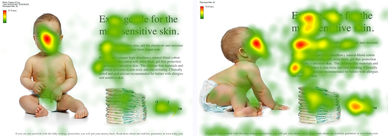
In this case, the right design got far better results.
Animations
Animations are getting more popular and if it’s used correctly, it can really make a website look awesome, but there’s a fine line between making certain elements animate and going overboard with animating the whole website page and every element.
Although web designers and UI designers like scroll animation and it can look cool, we need to think like the website visitor and sometimes it can be distracting.
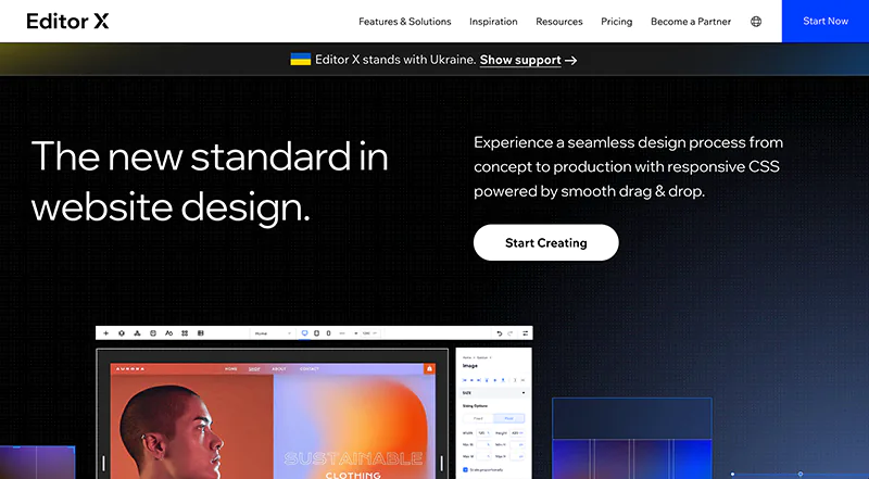
Editor X has some awesome animations, but if you prefer coding from scratch, Animate.css and hover.css are cool and free animation tools you can use.
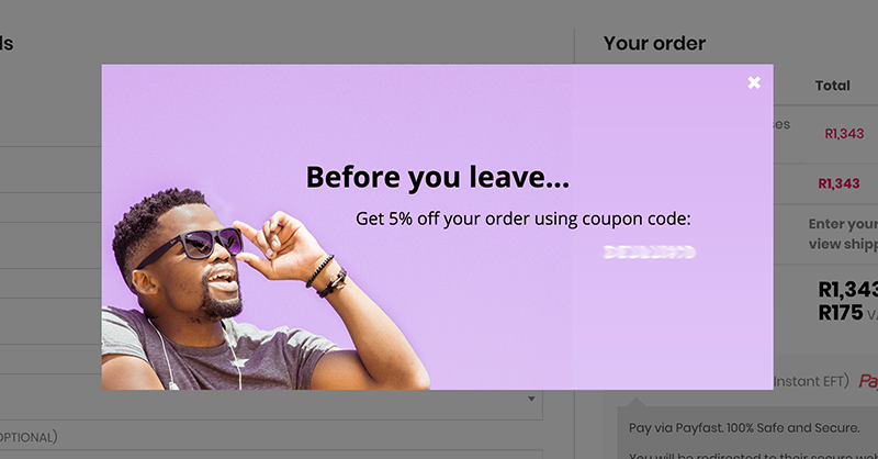
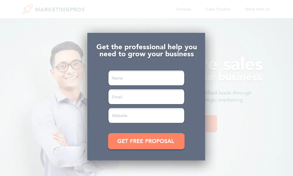
Popups
We all know that popups are annoying, especially those sleazy ones.
But when popups or exit overlays are done correctly, they boost conversions and it can be done in a non-sleazy way.
Here’s an example of a popup on SWD as you’re about to close the web page:
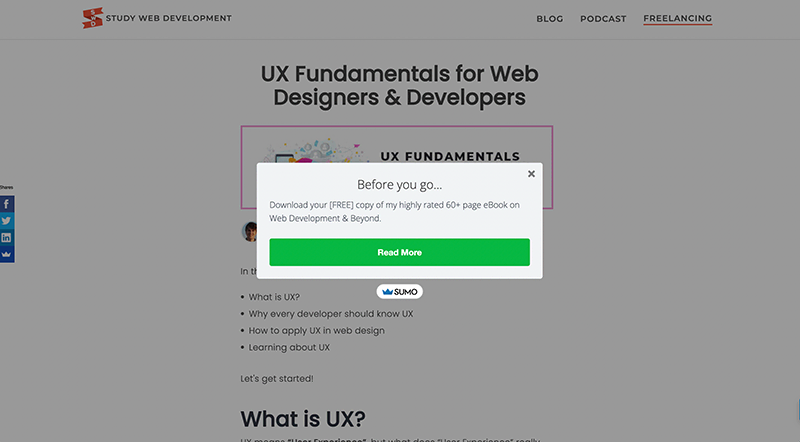
It’s not sleazy and it’s straight forward.
Size
Stick with the smaller popups and avoid the full-screen popups.
Timing
One of the most important factors in determining the success of popups is WHEN it pops up.
I’ve found that the best performing popups are when the website visitor is about to close the web page.
Website visitors are getting more annoyed with instant popups the moment you land on a web page or those scroll popups, so just stick to the exit-intent popups.
Pages
This is underrated. Should you add popups to every page?
My suggestion is as a general rule, yes.
But you should have a DIFFERENT popup for certain pages.
For example, on the checkout or sale page, you could have something like this if the website visitor tries to leave the page.
This was the popup we used for our ecommerce business and it worked well:
Bottom line: popups can really be effective if it’s done properly.
You can use Sumo.com or if you're using a CMS, there are usually plenty of plugins to choose from.
Footer Designs
Footers are often neglected in designing a website, but when done properly, they can be highly effective.
What is a footer? The bottom section of the website; another way of navigating the website.
If a website is too cluttered or doesn’t make sense, website visitors will often go to the footer to navigate to the section they’d like to go to.
It should have the following displayed:
- Main pages (popular topics)
- Social links
- Legal links
- Contact info
Extras like:
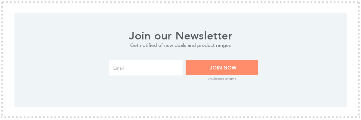
- Newsletter sign up
- Payment options
- Affiliated brands
…can also be added depending on the business services/industry.
Look at the analytics of the website to determine the most important pages and make sure you have this in the footer, listed in accordance of popularity.
This footer design is a winner for almost every industry if you struggle with your footer designs:
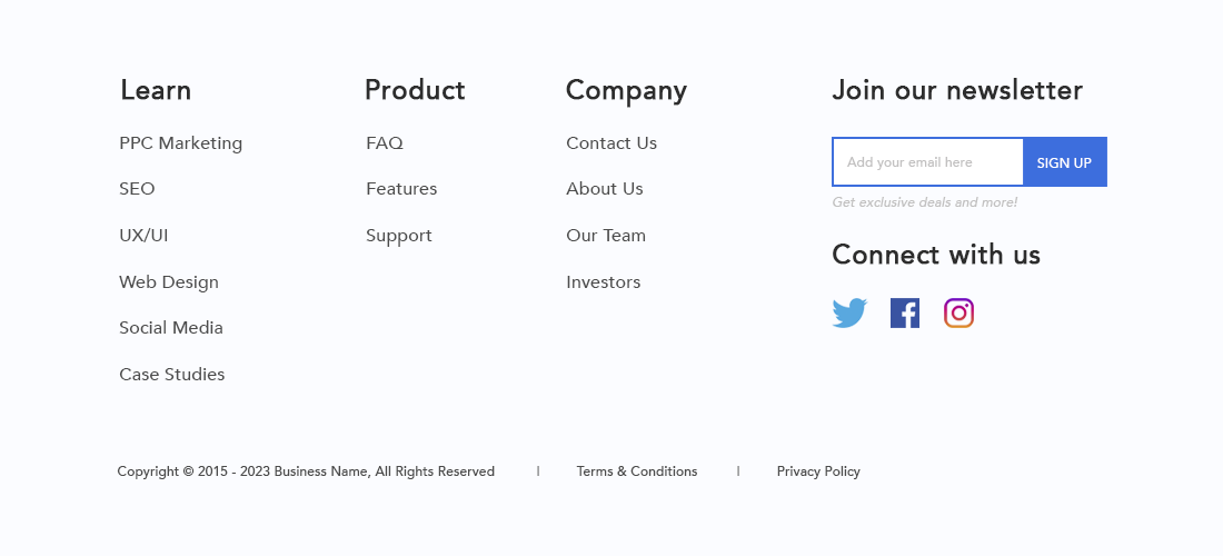
Replace the heading and links with what is relevant of course.
Landing Pages
A landing page is the page a website visitor lands on after clicking a marketing-related link like from Google Ads, social media or any marketing campaign.
Note: a landing page is not and should not be the home page.
Landing pages should accomplish 4 things:
- Remove the clutter and the fluff
- Highlight the benefits of the product or service
- Deal with and remove any doubt
- Get the sale
Can you guess one of the best things you can add to a landing page?
Think about if you were purchasing say a $500 course or something like that, what would you want to see?
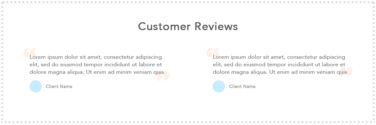
It’s simple:
We want to see reviews and case studies.
Why? Because it’s relatable and we buy what has worked for others.
There’s a reason why we buy highly-rated items on Amazon compared with an item that is not rated yet.
This is one of the MAIN aspects that need to be added to all landing pages.
How to Design Landing Pages
There’s no one-size-fits-all approach here, but there are definitely guidelines you should follow.
Every landing page should be designed with the following in mind:
- Why they should buy the product/service (benefits)
- Visual stimulation (images and/or video)
- Social proof (reviews/affiliations/case studies)
- No navigation bar (or a limited one)
- Highly-focused sales funnel with no distractions
What is a Good Landing Page Conversion Rate?
In other words, 100 people visit the landing page – how many should convert into a sale?
The average landing page conversion rate is 2.35% across industries, with the top 25th percentile of landing pages hitting 5.31% or higher (source).
There are a lot of variables here, and one of the main variable is what TYPE of website traffic are you sending to this page?
It’s better to have 100 visitors of your ideal target audience, versus 1,000 random visitors and this will affect your conversion rate as well.
Also, if it’s a free eBook versus something expensive, that will also affect your conversion rate, so it is also relative.
Landing Page Design Outlines
If you’re the type that struggles to create landing pages, I’ll cover a few great design options for you.
But first, I want you to think about it more because most of it is logical, but we tend to not think things through.
Remember the golden rule: think like the website visitor (with all their doubts and questions) as well as the business owner (with their goals in mind).
Remember the platinum rule: Keep it simple.
This example below is simple, but it covers the nuggets:
The triangle background divs form a point to persuade you to read more and it focuses your attention on the CTA.
You can use this for almost every industry, whether it’s a consultation, a quote or lead form for a download.
This one below is a great lead-capture landing page:
It’s simple, and when someone clicks the button, a (KISS) popup appears:
You might think, OK, that’s cute, but my client sells physical products and the above examples are only for services and digital products.
You are right to think this way, because the next one is on physical products.
There are probably hundreds of variations one could do, and this is by no means ‘the best’ one (if there is such a thing), so if you’re not too sure about how to design it, the below is a good benchmark.
We need to think like the website visitor here.
They are most likely going to come from an ad, say Google Ads, and that marketing campaign’s messaging needs to come across on the landing page as well.
Also, every category page is essentially a landing page and it needs to be treated as such in order to yield better results.
If I were consulting a mattress company (which I am 🙂), I'd suggest the overall landing page look something like this:
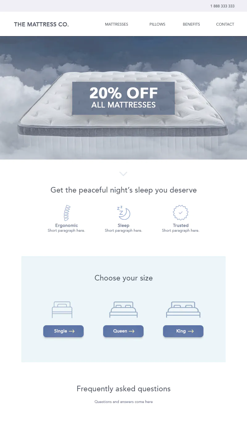
The sad fact is most e-commerce category landing pages are not designed effectively.
In thise case, they just go straight into the sizes without more information and benefits, so there’s a real opportunity for you to help businesses here, because this principle applies to all e-commerce stores.
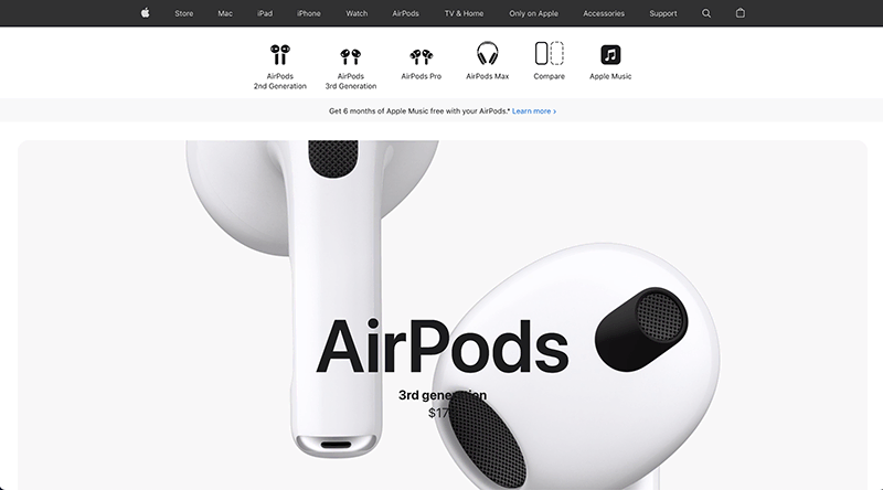
Just remember, that with products, you need to have (or it’s at least beneficial to have) an image of the product by itself, as well as someone using the product.
So let’s say it’s sunglasses. Don’t just have images of the sunglasses, but also have an image of someone wearing the sunglasses.
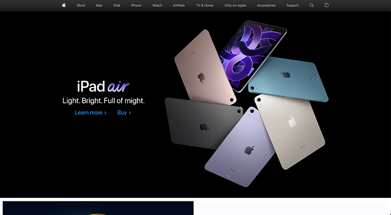
Apple are the masters of this with a great landing page design.
What Most Developers Don’t Do
In order to really perfect the landing page, you need to run tests and keep making improvements and I find that most developers don’t do this.
This is an opportunity for you to earn more income and also for the business to potentially increase sales.
You need to make continuous changes to the following elements:
- Pricing
- Colors
- Layout
- Text
- Images/Video
And by doing this, you will get to a place where you can improve sales.
Creating Effective Websites
Most website visitors scan web pages, so it’s important to portray what the business does and how they can help, all within a few seconds.
The principles we’re going to cover are:
- Layout
- Purpose
- Typography
- Technical
- Navigation
- Videos
- Call to Actions
- Top Navigation Strip
Layout
As a general rule, you should stick with website conventions.
What are website conventions?
It’s basically the most accepted or understood way of how things are or should be.
Example: It would be weird to have the hamburger menu on mobile in the middle of the page – it should be on the top left or top right and the website visitor expects that.
When it comes to the layout, you need to think about 5 things:
- Header
- Benefit to the customer (HOW the business can help them)
- Business services (WHAT the business can help with)
- Call to action (WHY the customer should work with the business)
- Footer
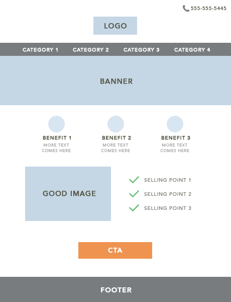
As a rough guideline for most websites, this is a general simplified layout to follow:
Purpose
What is the purpose of the website?
Having a pretty website means nothing if it doesn’t achieve the desired outcome for both the business and the website visitor.
It’s YOUR job as the developer to accomplish this, otherwise you’re not doing your job properly – it’s that simple.
This is where you need to have a ‘split-personality.’
PERSONALITY #1:
You need to think like a website visitor landing on a specific page to accomplish a specific task.
PERSONALITY #2:
You need to think like the business owner. What is their goal and what is their purpose for the website? More sales, more leads – what?
Regardless of whether you’re improving existing client websites or creating new client websites, this is how you should think about it.
All of your landing pages need to be aligned with the desired purpose of the client and website visitor in what they’re wanting.
If the purpose is to BUY NOW, you need to make it clear, but you also need to think about persuading the website visitor to buy, otherwise you’re only ticking one of the boxes.
Typography
Typography is your font, headlines and text.
Think of it as a way of communication.
What type of message do you want to portray to the website visitor?
Typography can get pretty advanced with things like Kerning, Finial, Counter’s, Bowl, Ear, Ascender Line, etc. which I’m not going to get into – I want to present the nuggets here.
When it comes to selecting general fonts, I personally like using Poppins in most cases and depending on the project industry and target market, I’d use a relevant font type for the headings.
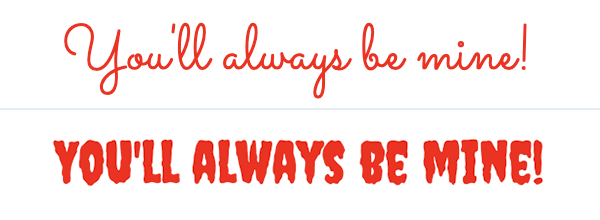
Example #1: Luxury
If the business you’re helping is selling expensive luxury handbags, which font would you choose between these two?
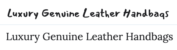
I’m sure you chose the bottom font in this case? (well I hope you did 🙂)
Example #2: Kids Birthday Cakes
If the business you’re helping is selling affordable and fun kids birthday cakes, which font would you choose between these two?
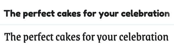
I'm sure you chose the top one? 🙂
The reason for doing this is I’m trying to get you to think about it logically and I hope these 2 examples helped you understand this practically.
Using the right words in a main and sub-heading can make a massive difference.
You want to portray the right message to a website visitor and by choosing the right font, size and color, it can deliver the right message along with the overall look and feel of the website.
Here’s a great example of how implementing the above in practice can portray the right and the wrong message:
Headings and sub-headings
When most people think of headings, they only think of one big headline, but they forget a hidden gem: the sub-heading.
These 2 headings go hand-in-hand and the difference of adding an effective sub-heading could be massive.
What is a sub-heading?
It’s a secondary headline that elaborates on the main headline above.
You need to highlight the benefits or to elaborate more on the main heading. The point of the sub-heading is to avoid any doubt and to encourage an action.
Good examples of this in practice:
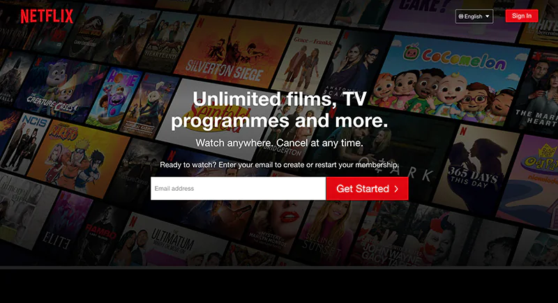
Netflix has a brilliant heading and their sub-heading is great. It addresses the website visitor’s doubts and reassures them with not being tied down to a monthly contract.
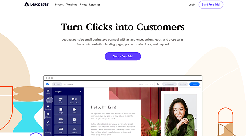
Leadpages’ text under their heading is really good. They elaborate who they are and how they can help – it’s that simple.
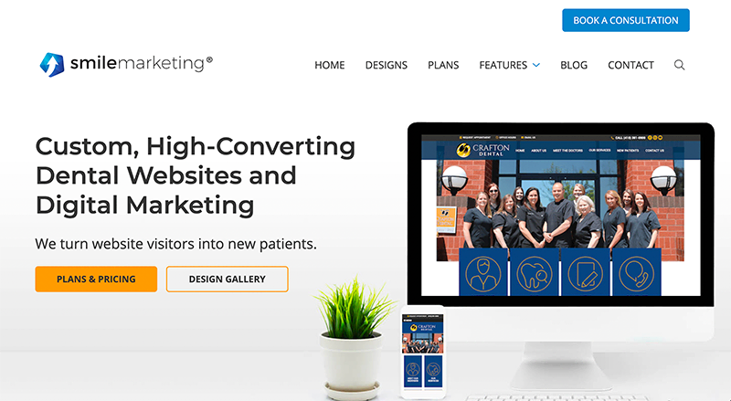
SmileMarketing nails it in their main heading and sub-heading. Simple, clear and KISS.
Character/letter spacing
CSS code: letter-spacing
No one likes reading words that have letters too close together or too far away, so it’s all about finding that balance.
Depending on the font size, a good general letter spacing to use is between 1px – 2px or 150% - 180%.
Paragraph line height
CSS code: line-height
When used effectively, it can make reading content much easier on the eyes, versus if it was all cluttered and close together. We saw why this is important in the white-space section.
Depending on the font size, a good general line height that looks good is between 25px – 30px.
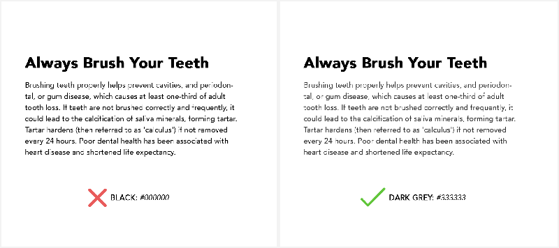
Contrast
By using a bold headline to break up text, it obviously makes it clearer, but there’s a cool and simple trick that helps it stand out even more and it looks classy.
You have the headline font color as black and you have the text color as a dark grey. There is also a benefit in doing this as it reduces eye strain from working on computers.
This is especially useful for blog articles and long content.
Example:
If you’re looking for fonts, the default and free option is to use Google Fonts or you can use premium options like TypeKit, Creativemarket.com or Myfonts.com.
I’d recommend working with a copywriter to help you with the right words on a website. Look for a highly-rated copywriter on Fiverr, Upwork or Hubstaff Talent.
Words carry meaning and as you can see, how the words are presented also play a major part in influencing how it is perceived.
So with that said, don’t shy away from charging a premium fee to your client for a copywriting service.
You could quite easily add 10-30% as your cut on top of the initial fee paid to the copywriter.
Technical
A website that takes too long to load or doesn’t rank on Google, is not effective in my eyes.
Not only does Google rank websites higher if they’re faster, but it’s also common sense that a fast loading website appeals to the website visitor.
This is a quote from Google:
“The average time it takes to fully load a mobile landing page is 22 seconds, according to a new analysis. Yet 53% of visits are abandoned if a mobile site takes longer than three seconds to load. That’s a big problem.”
According to a few studies, up to 79% of online shoppers say they won’t go back to a website if they’ve had trouble with page load speed.
Insane! That’s big potential revenue loss for a business.
Let’s look at some numbers to elaborate on this point:
If we work on a conservative, well-known stat that only 40% of website visitors will abandon a website site if it takes longer than 3 seconds to load and the business gets 100,000 monthly visits, how many potential customers would they lose?
40,000… (40%)
And if we work on a business selling an average product for $100 with an average of a 2% conversion rate per visitor (ie. 2 out of 100 visitors buy), that would be 800 missed out sales which is $80,000.
WOW! Imagine if they were selling services for $1,000+, the missed-out sales are massive.
The point I’m trying to illustrate here is the VALUE of the business missing out on potential sales.
This will help you in your approach to get the deal, because you’re not just saying “I’ll help you make your website faster” and you quote your hourly fee like everyone else, but you’re rather saying:
“Statistics show that over 40% of website visitors abandon a website if it takes longer than 3 seconds to load, and based on your current page load time of X, your average monthly visitors of Y, average product vale of Z and average conversion rate of A, you’re potentially missing out on $$$ sales and I can help you improve your website loading speed for $$.”
In fact, Amazon ran their own internal and external studies to determine that if their website took just ONE ADDITIONAL SECOND more to load, they would lose over $1,6 BILLION DOLLARS each year.
So with that said, use this knowledge to your advantage when dealing with clients.
Testing page load speed:
Use GTmetrix or PageSpeed Insights to determine page load speed.
Solutions to help speed up a website:
- Image compression (TinyPNG)
- Code compression (Gzip)
- CDN (Cloudflare)
- Media hosting (Publitio)
Another technical aspect is to design with SEO in mind.
General SEO nuggets to keep in mind:
- Page Title
- Meta Description
- URL
- Heading Tags
There are plenty of great SEO teachings out there, so I’m not going to waste pages here.
Take a look at this article from Backlinko to understand how to implement the above.
Navigation
There are dozens of different navigation layouts you can create, but as a general rule, there are 2 ways you can create an effective website navigation:
Navigation #1:
Navigation #2:
If there are a lot of subcategories, you could either have a standard drop-down menu or you can have something that looks more classy like this:
Side note: sometimes a thin top strip border can look cool – like in the example above.
Another thing to consider is to strategically name the category links.
There’s no reason to have the ABOUT US in the top navigation. The focus should be on the main services/products, call to action and possibly a contact link.
Bonus Tip: Remove the ‘HOME’ category link. It’s commonly known to click the logo in the navigation to view the home page. This helps reduce clutter.
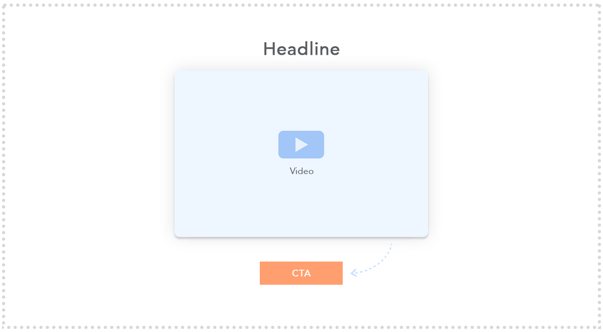
Videos (The Hidden Gem)
Adding videos to websites are crucial.
Every time I suggested adding videos for digital products, physical products and services, the business’ sales have skyrocketed.
The stats are insane:
82% of internet traffic will be video by 2022.
Videos could be animation, interviews, humor, how-to explainers, reviews, features, sales pitch, etc.
Always recommend videos to your clients.
2 practical examples of where videos can work well:
Insurance and accounting is all about trust. People want to be treated like a person and not like a number.
Solution: a quick intro video on the home page by the owner or one of the partners will instantly help the business stand out from being a ‘faceless’ corporate, to a corporate that is personable.
Another example is a hair salon.
You could have a 1-2 minute video explaining each service like the different types of haircuts, hair styling, recommended products, etc.
It sounds so simple, but you’d be amazed at how many businesses don’t have effective videos – and this is a great gap for you to fill.
How do you create the videos?
Shoot/design it yourself or outsource it.
There are plenty of good videography courses online and this often appeals to creative individuals.
I personally prefer outsourcing this task as I enjoy working on the ‘more important’ stuff.
That said, here are a few platforms you could hire a videographer or animation artist:
- Upwork
- 99 Designs
- Hubstaff Talent
- Fiverr
I recommend adding between 10% – 30% on top of the outsourcing fee for compiling the video as your cut. This will justify your time being the ‘project manager’ and putting everything together.
How do you edit the videos?
Use Camtasia (premium) or Camstudio (free) or Screenflow (premium)
Transcribing can be good for articles, especially to rank on Google.
What is transcribing?
It basically converts what you say in a video into text.
How do you transcribe?
I doubt you want to be listening to every word and writing it down?
Thankfully, there is software which pretty much automates this whole task. The best ones do cost a small premium (around $1per minute). Here are 2 recommendations:
- Rev.com
- HappyScribe.com
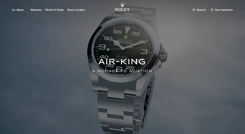
Another way of using videos as an effective tool is as a banner to tell a story, establish the brand history and to showcase exclusivity.
I like how Rolex use a video banner in this way:
Lastly, a final way of using videos effectively is for content.
Let’s say you help a client with content writing to rank better on Google through SEO.
You could add a monthly video to your retainer and add it to relevant articles, along with transcribing it.
This has helped us increase our monthly marketing retainers with clients and most importantly, it gets better results.
As a rough guideline, you could charge between $100 - $500 per video (excluding the outsourcing fee) to edit it, optimize it and add it to an article.
As a side note, an effective website ties in with effective marketing and videos are excellent for retargeting ads on Facebook.
So let’s say the business is selling sunglasses, you could get the owner or someone in the business to shoot 2 types of 30-second videos:
- 1 video focused on logic (the deal, saving, free delivery, happy customers).
- 1 video focused on emotion (how cool they’d look with it on).
You’d then only show those video ads to website visitors who did not place an order.
It sounds simple, but this is a great way to get more sales for your client and the best part is it works in every industry, regardless of the product or service.
We’ve implemented this strategy for many clients as well as our own projects and it’s been really successful.
It’s easy to just read over this section quickly, but seriously take this in as it can directly affect sales which is the end outcome of creating an effective website.
Call-to-Actions
A CTA is basically a button with the final purpose of the website, such as BUY NOW or TRY FREE TRIAL or CALL ME BACK, etc.
A very successful case-study of a call-to-action is The Million Dollar Button.
There was essentially only one main change to this website:
The button.
On the checkout page, they changed the word 'REGISTER' to 'CONTINUE' and it resulted in an additional $300,000,000 in additional revenue.
Sounds crazy I know, but this is just an extreme example of how important the right CTA can result in.
That’s why you need to keep testing the position, size, color and different text for each call-to-action until you find the sweet spot.
Understanding Call-To-Actions
Here’s the golden rule: if it doesn’t convert, it doesn’t work.
As you can see from the above example, you can see how a small change can result in significant results, which means that you should keep testing and making improvements/changes.
But how do you measure the conversion rate?
Not to get confused with any sales increase, this is actually a percentage.
Conversion Rate:
Amount of sales (or the desired goal like eBook download) / Total number of website visitors
Example: the website is visited by 50,000 people for the month and it resulted in 1,000 sales.
The Conversion Rate would then be 1,000 / 50,000 x 100 = 2%
Which means that for every 100 people that visit the website, 2 make a purchase.
This is important to understand because you can then work out if you create a better website or CTA that results in an extra percentage (from 2-3%) that can result in an additional 500 sales extra per month (that’s a 50% sales increase!).
So if their marketing is not good, their website is bad and you see room for improvement, a 50% sales increase is quite realistic.
In some client cases I’ve worked on, they saw a 200-400% increase in one year, but that’s mainly due to a terrible website and very bad marketing.
Knowing the potential and making these ‘judgements’ to see the potential can take some time, but you get better with experience.
Another important metric to understand is the CTR, which is the Click-Through-Rate:
Number of clicks / Number of impressions
Example: you have an ad running on Google Ads, it receives 12 clicks and it had 100 impressions (number of times it was shown).
The CTR would then be 12 / 100 x 100 = 12%
Another example: you have CTA on a web page, 300 people click it for the month and you had 10,000 website visitors on that page.
The CTR would then be 300 / 10,000 x 100 = 3%
These metrics are important to know because it will help you in your comparisons to see which CTA performs better.
With this technical foundation out the way, let’s get to the meaty part.
Call-to-Action Buttons
CTA buttons are buttons that incentivize action like to buy a product, register for a free trial or download an eBook.
Marketers actually go through a lot of data and tests to get the right CTA button copy, color, size, and position.
Why go through so much hassle?
Because having a better CTA button means more business.
Here’s an example of good CTA button from Editor X:
A quick look and you’ll see the main CTA here is the white and blue button.
In this case, I think having the "Start Creating" CTA the same color as the "Start Now" CTA would be even better.
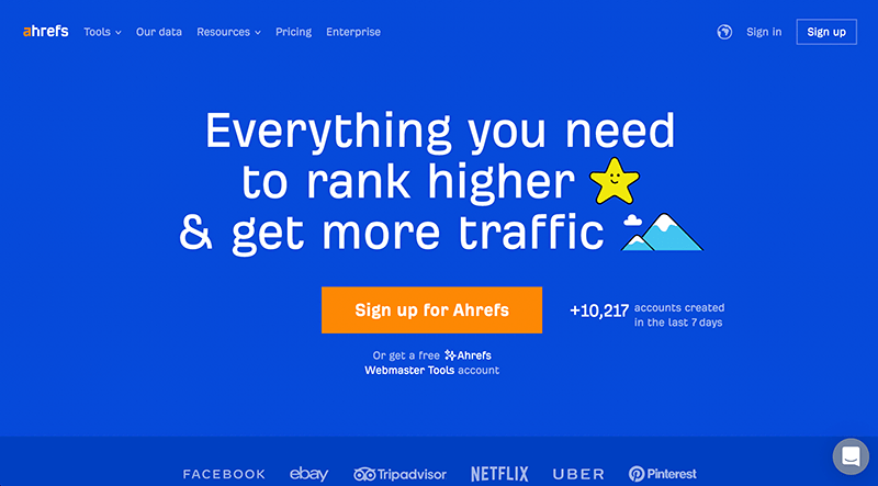
I really like the contrasting color and CTA from AHREFS too:
This leads to a big question:
What is the best CTA color to use?
There is none.
Although green, orange, and red are the most common choices for CTA buttons, there is no single color that guarantees the best conversion rate.
Instead of looking for the “best color”, what you need to aim for instead is creating the highest contrast.
HubSpot tested which CTA would perform better between a green and red button with no other changes.
The test went on for a few days and had over 2000 visits.
Results: The red button got 21% more clicks than the green.
Does this mean that red converts better than green?
Not necessarily.
You’ll notice that since green is the dominant color of the website, red stood out more. That’s a plausible explanation for its better performance.
Another test by Dmix which showed the red button outperforming the green button by 34%. But again, there could be a lot of factors to explain the result.
A/B testing is the best way to find the “best” CTA button color for a specific website or webpage.
Arrows and Text
Arrows
Adding a subtle arrow pointing towards your CTA can potentially boost your Conversion Rate.
Example:
![]()
Text
This has to do with text around or inside the CTA which can influence the CTR.
That said, here’s a good example from Grammarly:

I love the, ‘It’s free’ add-on here where most would just say, ‘Add to Chrome’.
Here are a few CTA changes you can consider:
Download Now – you can change to:
- Get My Free Copy
- Instant Download
Free Trial – you can change to:
- Start my free trial
- Try for free
- Get started for free
- Join free for a week
Sign Up – you can change to:
- Sign up for free
- Join 5,000+ others today
- Send me deals
Subscribe – you can change to:
- Sign up for free
- Join 5,000+ others today
Free Website Analysis – you can change to:
- Send my free analysis
Contact Us – (for agencies) you can change to:
- Let’s start a new project together
Then just underneath the CTA (or inside, but in small text), you can add one of these ‘CTA Boosters’ if it’s relevant:
- Cancel anytime
- Unsubscribe anytime
- No credit card required
- Trusted by over 5,000+ others
- Join 5,000+ others today
Basecamp does this well:
And I also do this for my freelancing course:
After you buy it (thank you ♥️), let's move on:
Top Navigation Bar/Strip
This section of a website is a gold mine.
The three main ways you can use this strip are:
- Promoting a special/deal
- Generating leads
- Notification announcements
Here are a few examples:


Make sure you use this space as it will increase conversions if used correctly.
Breaking Down the Web Design Process
I’m a big advocate for thinking strategically about how to design a website and I know that it can often be overwhelming – especially for your first few websites.
But if you have a process, it will make things much easier.
I think of a website page that has the following:
- Header (logo with navigation section)
- Banner
- Media: Video/Images and/or icons
- Text
- Customer reviews
- CTA
- Footer
Think of the page as being broken into divs or rectangles and then you fill in the blanks.
This is a helpful outline:
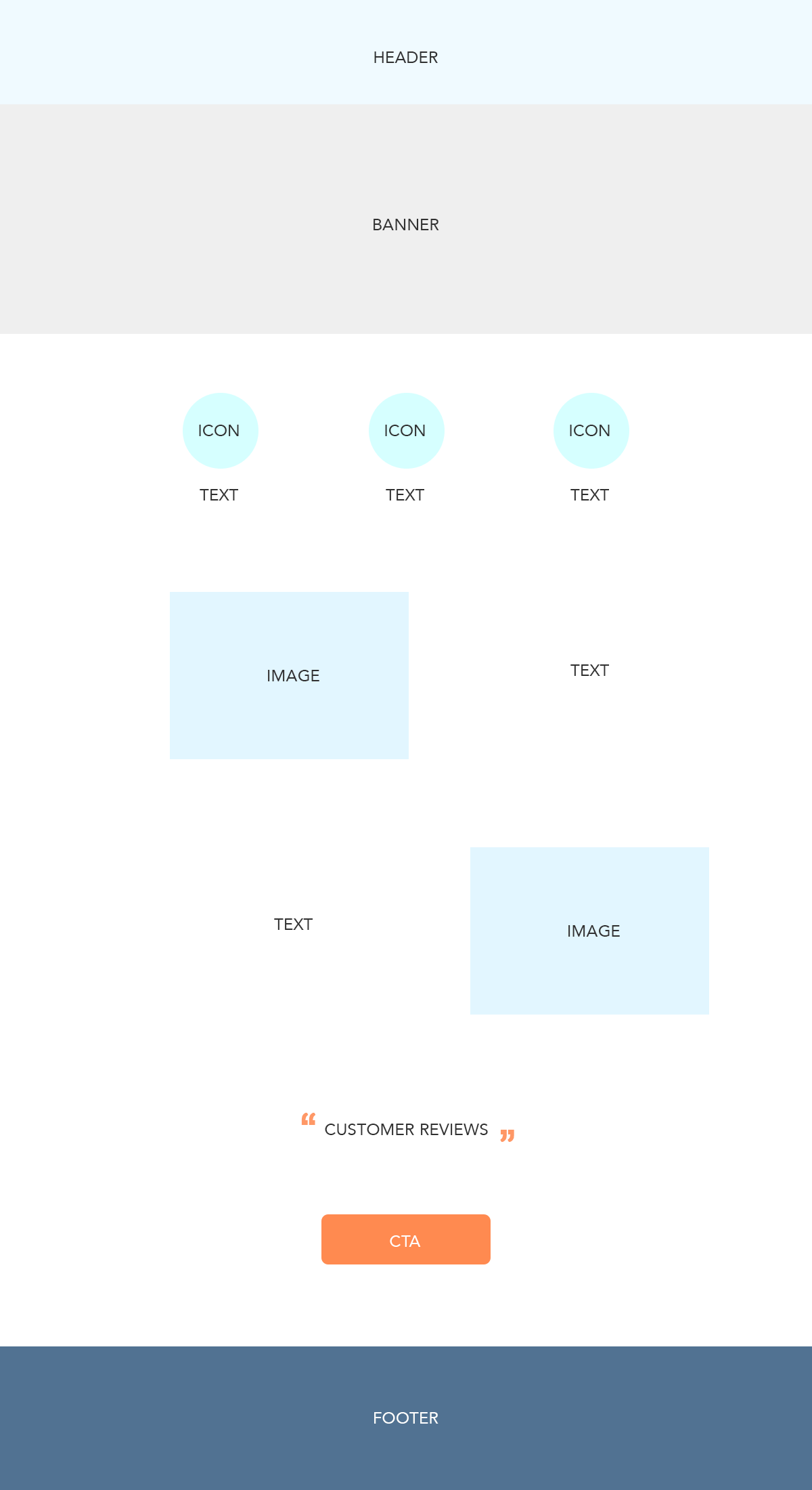
Now of course you don’t need to design it as straight forward as this, but that’s where the detail comes in – this is just a good outline to follow so it makes the process easier.
What do you start with first?
Unless you’re working on a landing page, every web page has the following:
A header and a footer.
So what I like to do is start off with the header section first, then put a random div section in the middle to take up space, then work on the footer.
That way, you have the overall look and feel of the whole website and you can duplicate it across every page.
Then all you need to do is work on the middle section.
Don’t overcomplicate it – it’s really that simple.
We discussed navigation and footer earlier on, so with that in mind, let’s look at the starting point:
Now that you have the header and footer sorted, what goes in the middle section?
This is where you need a good cup of coffee and you strategize, because every industry is different.
Here are a few div layout recommendations to consider:

Once I decide on the final layout, that’s when I work on the detail part like which images/icons, colors, fonts, etc.
What did we just do here?
Wireframing.
It’s literally just the term for creating the layout out of a website.
To wireframe, you can use tools like Editor X, Adobe XD, Photoshop, Figma or the good old pen and paper.
Just to be clear, one could design a lot of modern layouts, but I want to cover the 80/20 of web design tips for beginners ♥️
For some more tips, check Brad's awesome video:
Organizing Your Work Structure
As you can probably see by now, you’re dealing with a lot of different files, designs and documents.
So it’s important to keep things organized and there are ways you can be better if this doesn’t come naturally to you.
What will you need to be handling for the average client?
- Proposal Template
- Contract
- Invoices
- Images
- Passwords
- Documents
- Designs
- Website
- Marketing Campaigns
- Reports
The best thing you can do is have a folder for each client website, with each of the above being a sub-category – and then save the relevant file under the sub-category it should be in.
Then I would suggest you upload it to the cloud (Google Drive, Dropbox, etc.) for storage.
It’s that simple, but many developers overlook this aspect.
On a side note, I'm building ClientManager.io, a tool for freelance web designers that deals with client onboarding + management. Hopefully it will be a good solution for you to manage these things 🙂
e-Commerce: How to Use It Effectively
The industry of e-Commerce is exploding and it’s not showing any signs of slowing down.
In 2018, global online sales reached $2.93 trillion and are projected to climb up to $3.46 trillion in 2019.
With this kind of growth, you can expect more and more online stores to spring up every day all over the globe, which means more business for you.
What is e-Commerce?
e-Commerce is buying and selling products and services online.
If you’re interested in creating e-Commerce websites for clients, it’s best to be familiar with the most popular business models used in e-Commerce:
D2C – Direct To Consumer
In the D2C model, a brand sells products directly to consumers without third parties like retailers or middlemen.
This model enables brands to keep most of the profit while building a strong relationship with customers.
Drop Shipping
Drop shipping is an extremely popular model as it provides an easy entry to e-Commerce for those with limited capital.
In drop shipping, you can sell products without having physical inventory. Once you find a partner supplier, you can list their products on your website and focus all your efforts on marketing.
Once orders come in, you’ll forward it to the supplier, and they’ll be the ones to fulfill the order.
The main advantage here is you can forget about all the logistics of order fulfillment and holding inventories.
A popular platform where drop shippers can look for suppliers is AliExpress. You can integrate websites with these platforms to automatically import products and notify suppliers of orders. You can learn how to setup a dropshipping service with Editor X here.
Print On Demand
In the print-on-demand model, you can sell t-shirts, bags, hoodies, and even jewelry with your custom design.
But unlike the traditional model where you have to print everything out in bulk, you only have to print what is ordered. This saves so much time, money, and effort. Some popular POD platforms are Printful and Teespring.
You can integrate Printful and other third-party popular POD platforms within Editor X and learn the process of setting it up here.
Which e-Commerce Platform Should I Choose?
Like with fast-food, there are hundreds of options to choose between.
The bottom line is that Subway is way better than McDonald’s.
Glad we are in agreement then. Moving on…
I want to list a few notable ones (based on popularity and my discretion):
- WooCommerce
- Editor X
- Shopify
- Opencart
Here’s my bottom-line verdict:
- If it’s a big e-commerce store (500+ products) use WooCommerce.
- If it’s a smaller e-commerce store (under 500 products) use Editor X.
Here's a great walk-through to create an e-commerce store on Editor X:
What Makes a Good e-Commerce Website?
Considering that e-Commerce as an industry is growing at an exponential rate, the chances of getting a client who wants a high-quality e-Commerce website are high (and lucrative).
All e-Commerce websites have one purpose – to sell whatever it is your client need to sell.
Whether it’s pet food or kitchenware, the website should do its job and sell as many as it can.
Here are a few tips to create an effective e-Commerce website:
Easy Shopping Experience
The first rule of e-Commerce is: Make everything easy for customers.
From browsing products to adding them to cart to processing payment, everything should run smoothly.
How to make the shopping experience as easy as possible:
- The home page should clearly state the client’s value proposition. What are they selling?
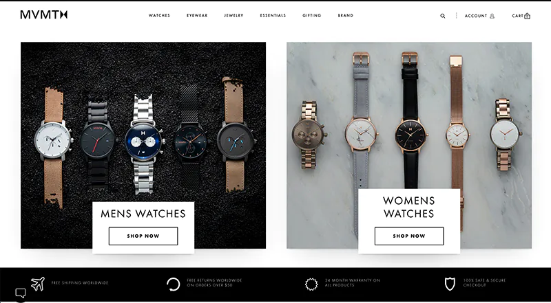
MVMT has a great watches page where you’ll understand their offer before you even blink.
- Make navigation easy. Nothing will frustrate customers more than being unable to find what they need. You have to give them a good place to start. They should be able to tell where to go next right after landing on any of your pages.
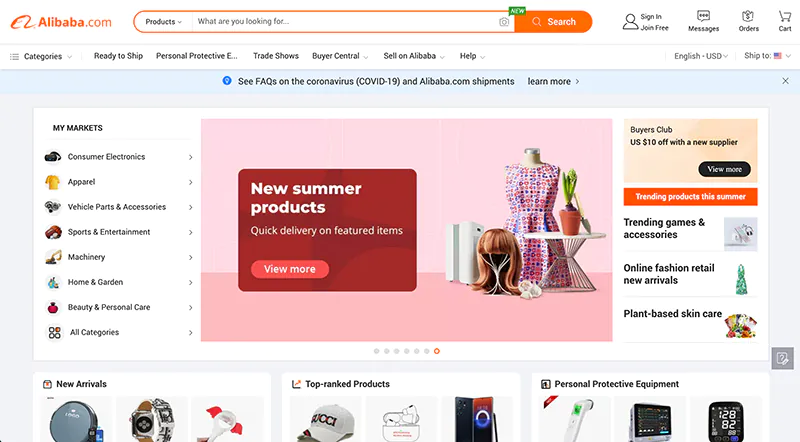
A step in organizing your website and simplifying the navigation is by categorizing the products and displaying the categories where they can be easily seen. Alibaba does a really good job here.
On their homepage, you will see an initial list of the most popular categories and an option to see all categories:
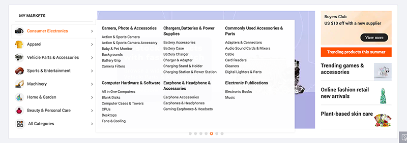
When a customer hovers over a category, they see these sub-categories:
- Don’t overwhelm customers with all your products at once. You can dedicate a space on the homepage to feature the client’s best-selling, featured or popular items. Whatever it is, make sure that viewers will not feel overwhelmed with too much information.
- Make adding and viewing the cart pain-free. When you shop in a grocery store, you expect to have a shopping cart that you can take anywhere with you and conveniently put items on. The cart shouldn’t be hard to steer, and there shouldn’t be any extra step for you to add items on it. Customers should have the same experience in an e-Commerce website. Adding items and viewing carts should be fast, easy and lag-free.
- Make the checkout process a maximum of 3 steps. Anything more than that is likely to turn potential customers away. In a recent survey by Baymard, they found that 22% of respondents abandoned carts because of a long and complicated checkout process:
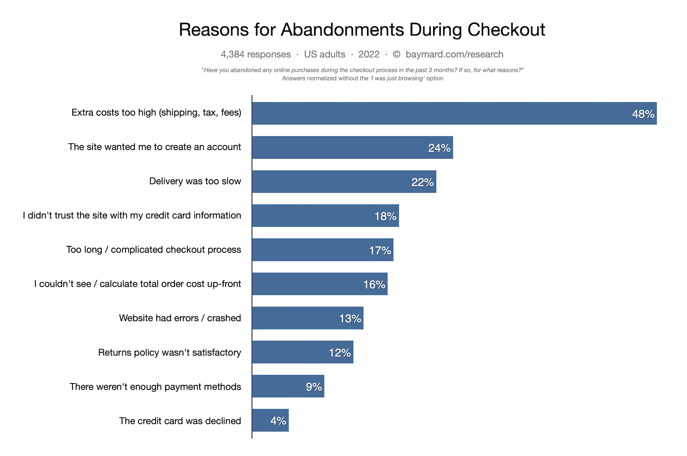
Other reasons listed in this graph also have something to do with the checkout process. 24% of the respondents said they abandoned at checkout because they didn’t want to create a new account.
When should there be an account?
If your client sells products that people want to buy regularly (1-3 months), then have an account.
If it’s products people only buy once a year or more, then remove the account as your client is losing out on almost 1/3rd additional income.
Other reasons like not being able to see the total cost, website errors, not enough trust established and not enough payment methods are also in your power to solve. Make sure to address these issues to give your clients the best e-Commerce website.
Easy Mobile Shopping Experience
Mobile is where shoppers are at. A survey by eMarketer found that in 2018, 39.6% of retail e-Commerce sales came from mobile shoppers, accounting for $208 billion.
- Around 79% of Americans have made an online purchase, with more than half having made purchases on a mobile device.
- If users have a bad experience in your mobile store, they are 62% less likely to buy from you in the future.
- 40% of online shoppers use their mobile device to research before making a purchase.
These statistics point to one thing: you can’t ignore mobile e-Commerce. If you do that, you’re doing your clients a disservice.
So what can you do to make mobile shopping a pleasurable experience for customers?
- Build responsive mobile websites.
- Streamline mobile checkouts by reducing form fields, enabling shoppers to quickly save their payment details and personal information and optimizing screen space.
- Speed up the site loading time.
- Keep the navigation simple and easy for anyone to figure out. One in four online shoppers abandon their carts if a site’s navigation is too confusing.
- Pay attention to mobile SEO.
Quality Product Images
Shoppers want to see quality images - it's that simple. The more details the photos can offer, the better.
Photos that offer insights on the material, dimensions, how it fits or how it looks like in a real-life setting stand out and help shoppers make more informed decisions.
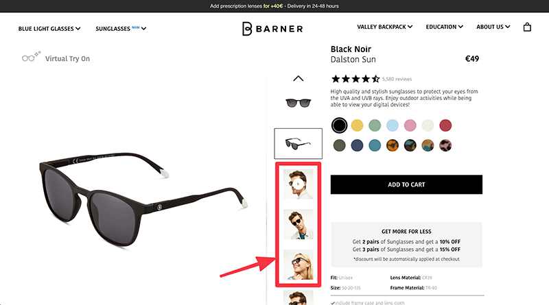
BarnerBrand's product images are a perfect example for this. All sunglasses have the product image + an image of someone wearing the glasses. You can always advise your clients to have a product setting + use case image.
This helps shoppers visualize how the product is going to look on their skin and it helps the product come to life.
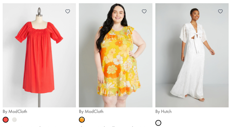
Modcloth, a women’s fashion brand, also brings their ‘A’ game when it comes to product images. Unlike most brands that only show models with a small body type, Modcloth uses photos of models with different body types, giving women a more inclusive and visual experience:
Detailed Product Descriptions
A well-written product description goes beyond the usual sleep-inducing list of features and sprinkles in a story and more useful details. It addresses shoppers’ pain points, shows them the benefits of the products and engages their imagination.
I know that as a website designer, you’re most likely not in charge of the copy, but this is one area where you can give sound advice to your clients. Outsource this task to a copywriter, add your cut and make it happen.
Easy Refunds & Returns Policy
Refunds and returns are unavoidable no matter how hard business owners wish against it. Your role is to make it easy for shoppers to know the refund and return policy both before and after the sale.
Most stores place the refunds and returns policy link in the website footer. That’s where shoppers would expect them to be, but it’s also a good idea to include the refunds and returns link on every product page.
On the refunds and returns policy page, make it easy for shoppers to see the store’s promise and make sure every detail is covered.
Product Reviews
Online shoppers are generally skeptical and they research reviews before making a purchase.
Podium found that 93% of respondents said online reviews influence their buying decisions.
These stats just mean that whether your client is purely an online store or a mix of both brick-and-mortar and online, gathering and publishing product reviews is important in boosting the shopping experience.
As a web designer / freelancer / agency owner, it’s your job to decide where to place the reviews and how to format them.
Generally, the bottom section of each product page is a good place, as well as overall reviews on the home page. It’s just important to make them easily visible.
Good ‘About Us’ Page
The ‘About Us’ page often takes a backseat during the process of building an e-Commerce website. It’s more like an afterthought than a priority, but this approach can’t be more wrong.
More and more online shoppers are getting interested in the story behind the brand. They want a face to associate with the products. They want to know how it all started and what the brand is all about.
Underlining this desire is the trend towards building relationships beyond consumerism. People want to do business with people, not businesses.
TOMS, the shoe brand, has an interesting backstory and they tell it well in their ‘About Us’ page:
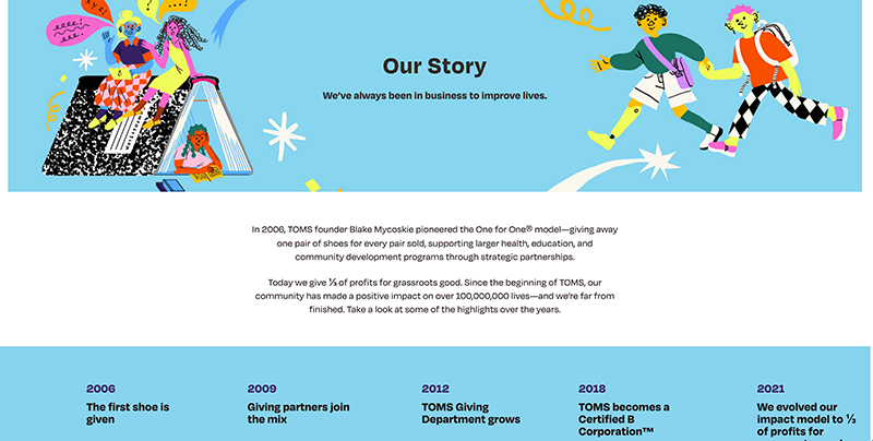
The main promise of this brand is for every pair of shoes sold, they would match it with a new pair of shoes for a child in need.
It’s a good and curious promise, and shoppers would want to know why the brand decided to do this. How did they arrive at such a concept? Who’s behind all this? Knowing these details will make shoppers even happier to hand over their hard-earned money to this company.
Encourage your client to share their story and design it in an interesting way. Don’t be afraid to break the mold. Include clear pictures, videos and other media formats to make it more visually appealing.
Trust & Credibility
As the web designer, it’s your responsibility to make sure that the website complies with security standards and overall feels credible and trust-worthy. If people don’t trust the website, they won’t buy.
- Get an SSL certificate. This is absolutely required. No e-Commerce store should be running without this.
- Include trust badges. Trust badges or icons signal that it’s safe for shoppers to give this website their payment details.
- Show off the brand’s social media presence. If people see that the brand exists outside their website and it has real interactions with real people, it boosts the brand’s credibility.
Extra Tips to Help Clients Get More Sales
Remember that you are more than a website designer; you’re practically a business consultant. Your ultimate responsibility is not to “build an e-Commerce website” but to “build an e-Commerce website that sells (well).”
Here are a few more tips that e-Commerce stores around the world are using to get more sales. Suggest and implement these to your clients:
Live chat
Live chat is an emerging piece of tech that more websites are taking advantage of. Users love it because it’s easier and faster than sending an email or calling a company and it boosts revenues too.
Total Gym found that fewer orders were coming in via phone while their website traffic was steadily increasing. The problem was, the conversion rate was too low for their liking.
They experimented and installed a live chat app on their website. They eventually saw a spike in online orders by as much as 39% across all devices (this is massive).
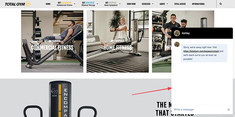
You could consider Tawk.to, Editor X or Indicom for this.
Growing The Email Database
It’s a well-known fact that email marketing is an important aspect of marketing across all industries. It may not seem like it, but email still reigns when it comes to ROI and customer retention.
It’s important to start building an email list as soon as the website is up. Some of the simplest ways to collect emails are by using newsletter subscription forms and pop-up forms.
Pop-up forms may be annoying for some (as we discussed in a previous section), but research shows that they’re still effective – especially if you pair them with an irresistible offer like a free shipping or exclusive coupon codes. That’s what Total Gym does with their pop-up:
Cart Abandonment Recovery
Another importance of collecting emails is recovering abandoned carts. Shoppers abandon their carts for a lot of reasons as we’ve discussed before, but that doesn’t mean it’s a lost sale.
You can set up an automated process where an automatic reminder will be sent to a shopper’s email address once a cart is abandoned. We do this for most e-Commerce clients and it works like a boss.
The email can be something like this:
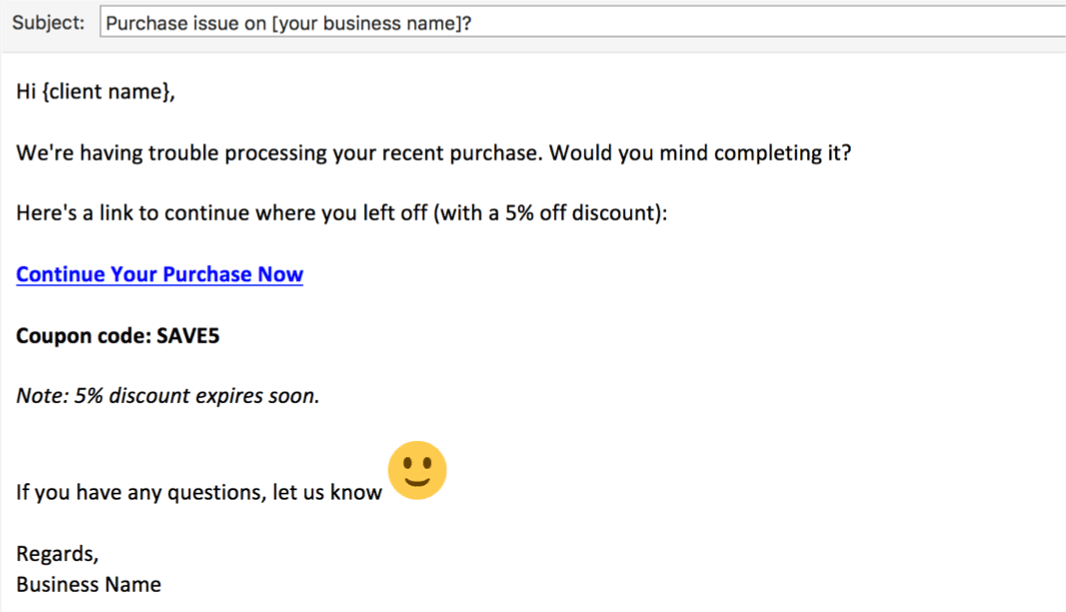
And it’s configured to send 30-min after they abandon their cart.
Limited Time Offers
Another proven way to increase conversions is to make people order NOW to avoid missing out on an amazing offer.
Creating a sense of urgency and scarcity has been proven time and time again to get people to hurry up and purchase right away.
One important note here is that it has to be genuine. These sleazy sales tricks that say “offer ends in 2 days” and it keeps running indefinitely is a joke and it upsets people, so be sure to do it ethically.
Bonus Tips for e-Commerce
Incentivize Sharing After Purchase
SOOO many e-Commerce stores don’t do this. It’s a Yoda move that they don’t teach you at school.
❌ Don’t do this:
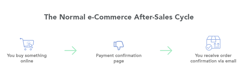
✅ Do this:
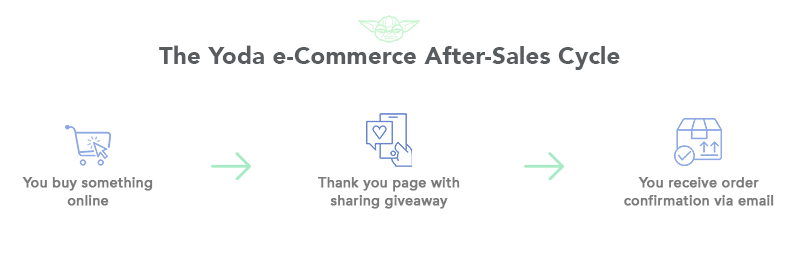
#theforceisstrongwiththisone
Rather than a normal thank you/payment confirmation page, the page will be a thank you AND a social giveaway.
Let’s say you bought bluetooth earphones, you landed on a thank you page that says:
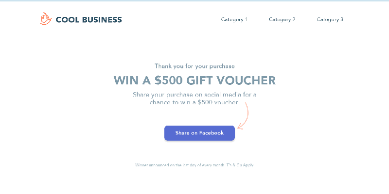
You’d probably share it, right?
The logic is, it will cost only $500, but this is such a small amount to pay to get exposure from loyal customers referring their friends to buy from your client’s business.
Getting Business Reviews
Negative customer reviews can affect businesses tremendously, and the same is true for positive reviews – it can often mean the difference between a successful and non-successful business. It’s true for every industry and we all know it.
That said, there are a few tips you can improve your client’s business perception when it comes to getting positive reviews.
First, decide where you would like people to review the business.
Yelp, Facebook, Google or some other platform?
Then work on an email that says the following:
Take note of the stars in this email.
It’s not one image – it’s two separate images.
If they were to click on the blue stars, it would link them to a contact page on the business website to say that the business is sorry they feel this way and they want to make it up to them – they need to fill out a form and management should get in touch with this unhappy customer.
If they were to click on the yellow stars, it would link them to Google/Yelp/Facebook/TrustPilot (whichever is relevant to the business).
Can you see the difference between the two options here?
You then send this email 7-10 days after they received the product/service and then it will be a matter of time before you start seeing some positive reviews come in.
This strategy can work for service and product industries, whether it’s a doctor or a shoe business.
Blog Tips and Guidelines
I believe every website should have a blog page.
It’s good for the following reasons:
- SEO – ranking on Google
- It showcases your expertise in the area
- It can generate more sales
Here’s the golden rule for creating a blog:
If the content is nonsense, don’t expect to get results from it.
Even if the website sucks, if the content is good, people will want to read and share it.
But do both: quality content and a good website.
Regardless of which industry your client is in, they can have blog articles.
Creating Article Guides
One of the best ways to create an effective blog is to write long article guides.
It’s important to remember that quality is better than quantity here.
Even if it’s only a long, next-level good article every 2 or 3 months, that’s way better than a weekly, rushed and fluffy article.
Aim for between 3,000 – 5,000 words for these ‘guides’.
Add videos (preferably the business’ videos), link to relevant pages within the website, add an infographic and images.
Layout Options
There are two main ways of laying out blog articles.
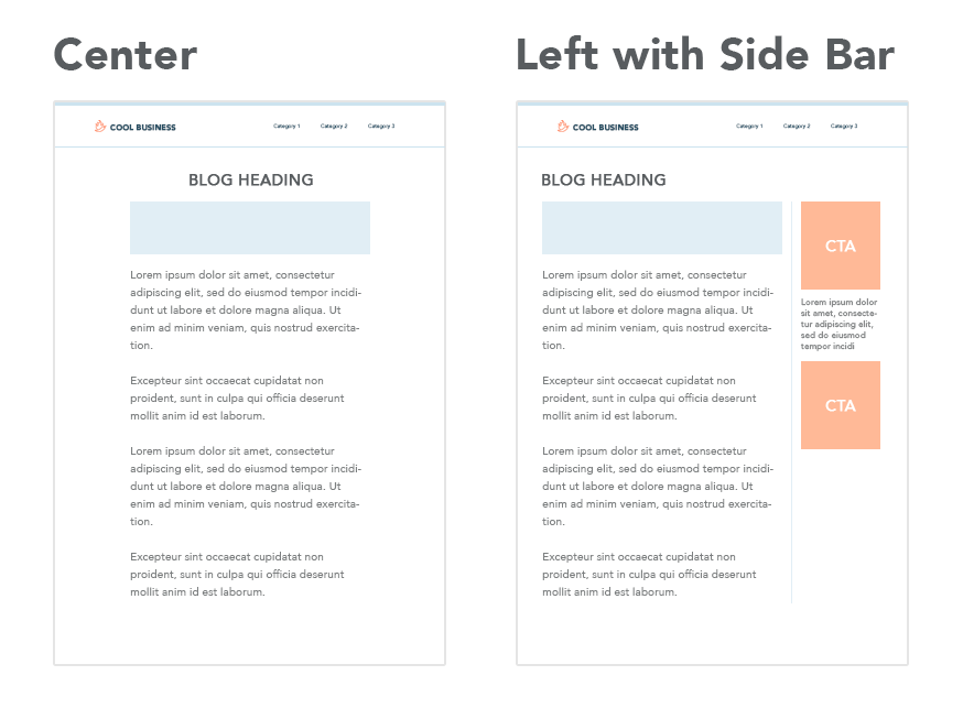
Which is best?
Either, but I personally prefer the center option.
General Blog Tips
Width:
The width of the content should be around 600px – 800px. This makes for easy reading, like you’re reading a page on a book. Narrow is good in this instance.
Paragraphs:
In school (for those who listened), they taught us how to be sheep and write long form content or essays. I want you to forget about this. People nowadays read short-form content and the paragraphs need to be in alignment with this.
Keeping in mind over 50% of website visitors view a website on mobile, there needs to be breaks in the content, and the way to do this is to keep the paragraphs short.
Chances are, the blogs you read have short paragraphs, and there’s a reason they do this, because it works.
Configuration:
Should you use WordPress or a normal static website for the blog? I’ve used (and continue to use) both, but I am leaning more towards WordPress lately. It depends on if you want to use a CMS (Content Management System) for the website in the first place or if you want to code it.
My thoughts are if it’s a simple website with only 3 – 4 articles a year, I would use a static website and if it’s more complex, with more regular updates, opt for WordPress.
But either can work in both cases, so it boils down to preference here.
Promoting the Content
You can create the best content, but if nobody reads it, what’s the point?
The goal of the article is to be so good that it’s worth promoting.
There are two main ways of promoting the content:
- Google Ads
- Social Media (Paid)
Examples:
You have a client in the insurance industry and their article is on ‘Life Insurance for Young Professionals’, so you then promote that article on social media to that specific target audience.
You have a client selling sunglasses and their article is on ‘What are polarized lenses?’ and you then have Google Ads and social media ads promoting it.
This helps to create brand awareness, it builds credibility and it can generate sales or leads.
MOST businesses don’t actually do this, so it’s a great option for you to handle the content and marketing for them, which you can obviously charge for.
We do this for most of our clients and it’s a great way of building a marketing retainer each month.
Tracking and Reporting on the Data
We’ve all heard, “The customer is King” and “Content is King.”
But in (effective) web design, “Data is King.”
Knowing the difference between a poorly designed page and a high-converting page is crucial as it will ultimately result in more sales.
You will know how a page performs by looking at the right metrics.
It’s important that you don’t get distracted by the fluffy metrics.
The nugget metrics to focus on are:
- Unique website visitors (you want to know the website traffic)
- Location of website visitors (this will help for targeting ads)
- Time spent on page (generally speaking, the longer, the better)
- Page load speed (always work on making it faster)
- Traffic channel/source (see where your traffic is coming from)
- Search queries (what they type in on Google to find the website)
- Popular pages (will help for promoting and to see improvement)
- Bounce rate (the lower, the better)
- Goals (seeing if the desired objectives are being achieved)
How do you get all the metrics?
I’d suggest using Google Analytics (it’s free and has good features).
How do you run tests?
You first need to know what the PURPOSE is before you run any tests, because what are you going to compare it with? Is it making a booking, phone call, watching a video longer, signing up for a free trial, getting a lead form – what?
Then you run AB Split Tests. You can either use tools like Google Optimize, Crazy Egg, VWO, Pingdom, Hotjar or you can just write down the main nuggets like the website visitors, CTR, how much marketing budget was spent and what it resulted in – now you have a benchmark to compare it to (say the previous month as an example).
On a practical note, the more people you can ‘test’, the better.
So you can’t do a test on 10 people. You should at least have 1,000 visitors on the page at the absolute minimum.
Then you see the results and you make relevant changes, then do another test for the same amount of people.
Now you can compare apples with apples.
When should you run tests and for how long?
This all depends on the amount of traffic the website is receiving. If the web page receives 10,000 visits per day, you’ll get a good enough idea after one day.
But if you can do the test for a full month, this is even better, because people’s buying behaviors are different, and often when people get paid, that’s when they spend money depending on the product or service being offered.
Also, you can’t compare the end of November (with Black Friday) to the end of October as that’s comparing a pineapple with an apple – not the same thing.
What should you change?
As you’ve seen in previous sections, sometimes the simple changes can result in better outcomes. So I recommend that you don’t change too many things, because you won’t know what exact change made the difference.
It could be text, colors, sizes, images, layout, etc.
Conclusion
Alright, it's a long one, but I hope you found value from these web design tips!
If you think this article will help others, I'd appreciate a share ♥️
Not on my monthly newsletter? Consider subscribing here.
-
That's it for now - thanks for your support!
To your freelancing success,
-Kyle